Forms
Overview
A form is like a type of conversation. The communication between the user and the application form. It is important to think through what the necessary data is, and how this data will help the users complete their goal.
Information#
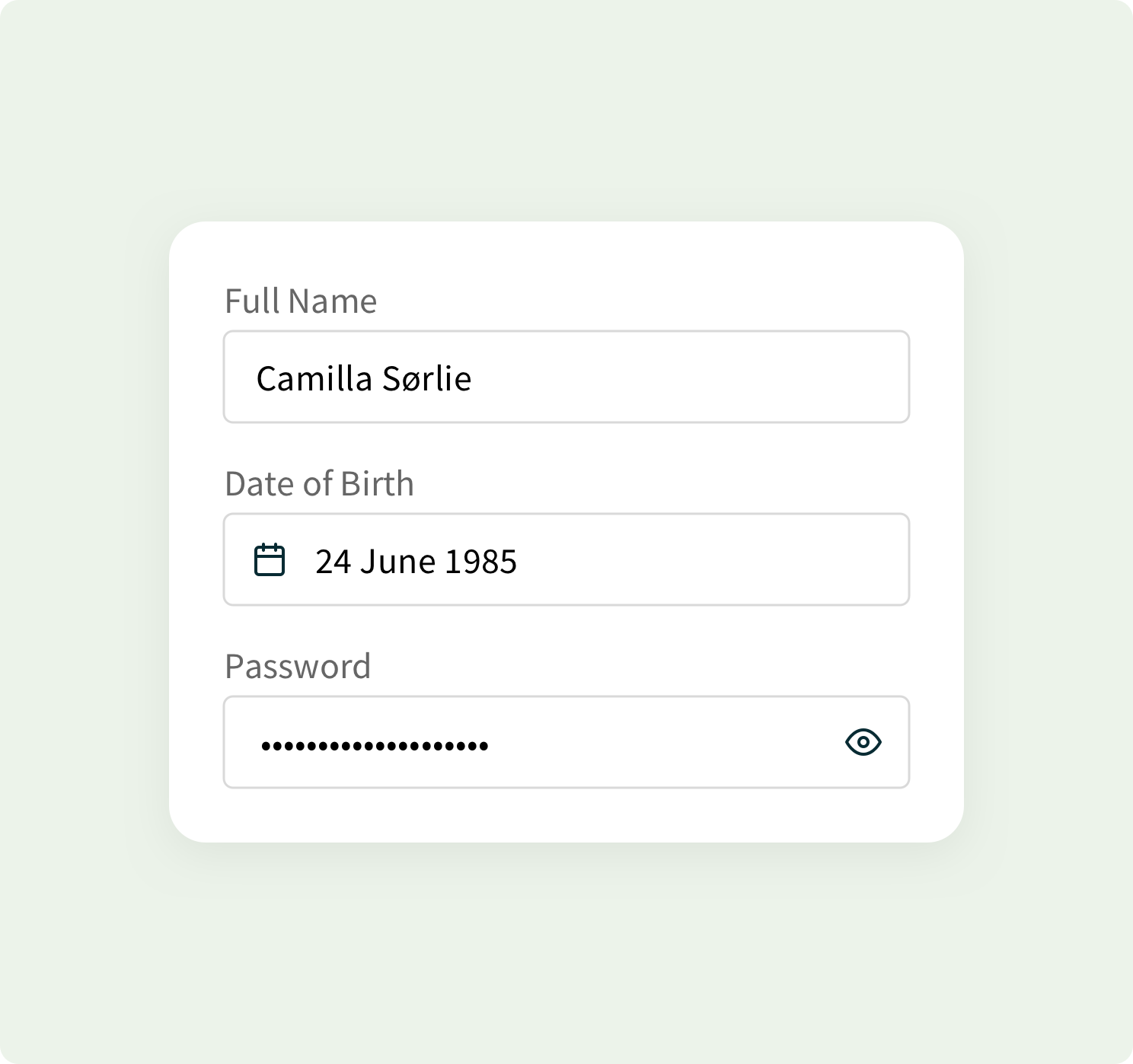
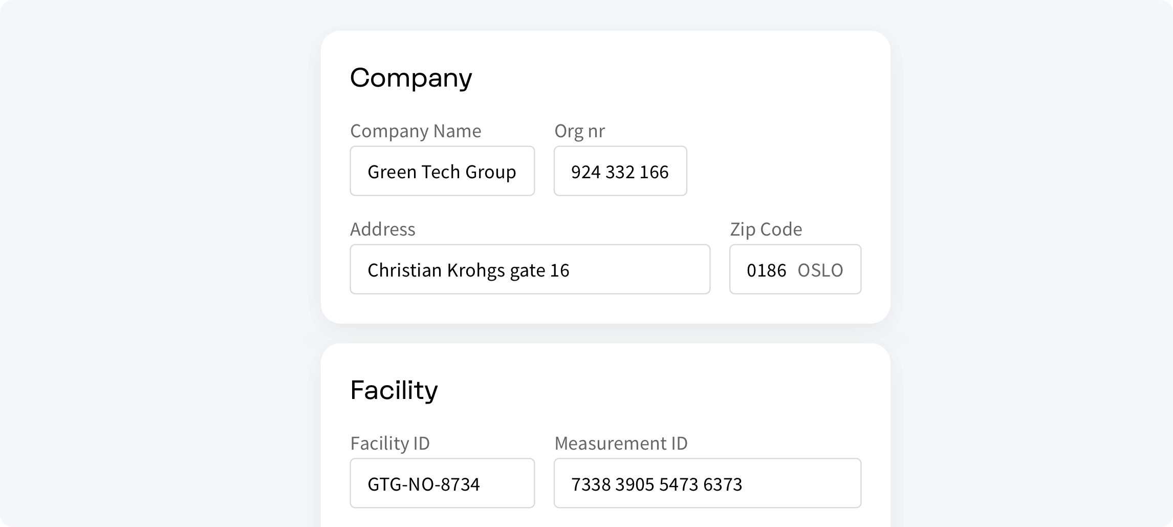
It is important to minimize the number of fields and focus on the most important ones. Always consider why we are requesting certain information from the user. Ask about information logically from the user’s perspective, not from the application or database’s perspective. By reducing the number of fields, it will remove the visual and cognitive load, and look much simpler. Don’t ask for the same information multiple times.
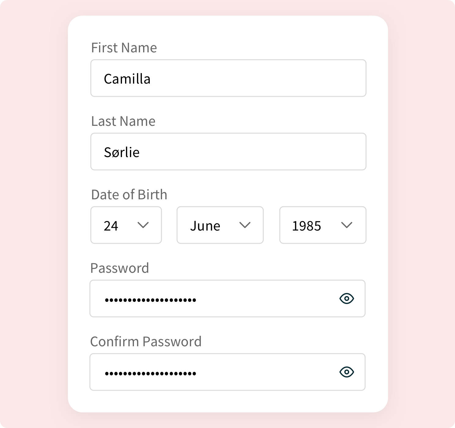
If there is a need for required or optional fields, these needs to be clearly marked. Use conditional logic to automatically show or hide fields and skip pages in a form based on the users input. By doing this we can reduce the number of steps and make the progress more personalized.
Groups and clusters#
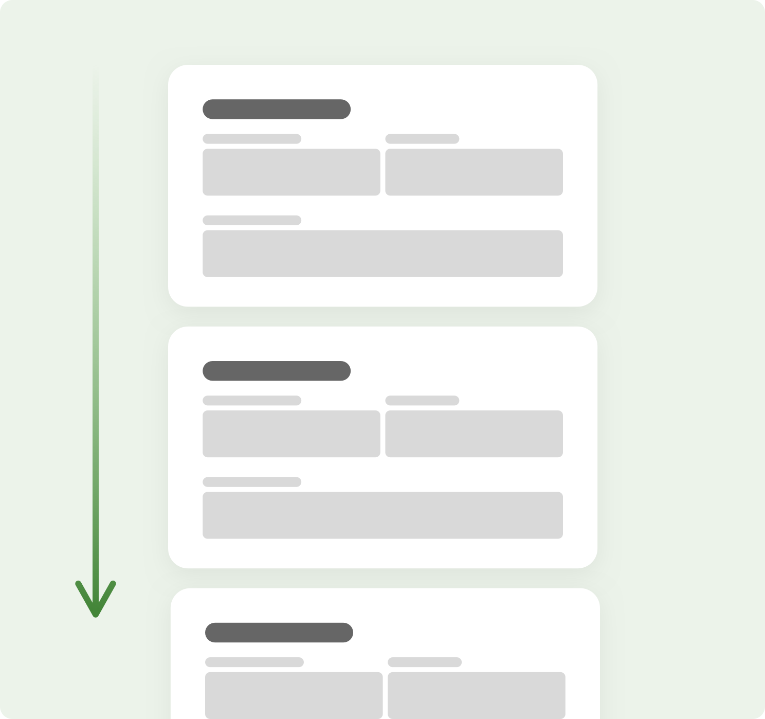
Group related information into logical blocks or clusters. Grouping multiple unstructured fields into few manageable clusters will help users make sense of the data they are inputting. Grouping will also significantly increase form usability.
Column’s#
It is highly recommended to use one column layout when creating forms. The reason to avoid using multiple columns is that users can interpreted the fields inconsistently, it can slow down the speed of comprehension, and cluttering the path to completion. This clutter can cause users to skip important fields, inputting data in the wrong fields, or simply coming to a halt. One column layout creates a clear path to completion for the user.

Stepper#
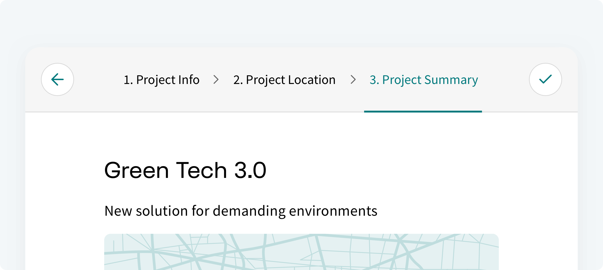
Sometimes even after removing everything unnecessary, some forms can get huge. Breaking up the many tasks into a series of smaller steps can make it easier to understand, focus and motivates users to carry out the process to the end. It helps to display steps and visually communicate progress.
Consider focusing the user interface on only the task at hand, minimizing general navigation elements or any elements that can disrupt the process or create confusion.
Use clear signposting. Instead of using generic “Next” and “Back” buttons, write a microcopy that gives clear information about the steps ahead. Instead of “Next”, you could use, “Continue to summary”. Although it’s wordier, it creates greater transparency and trust, and a sense of progress.
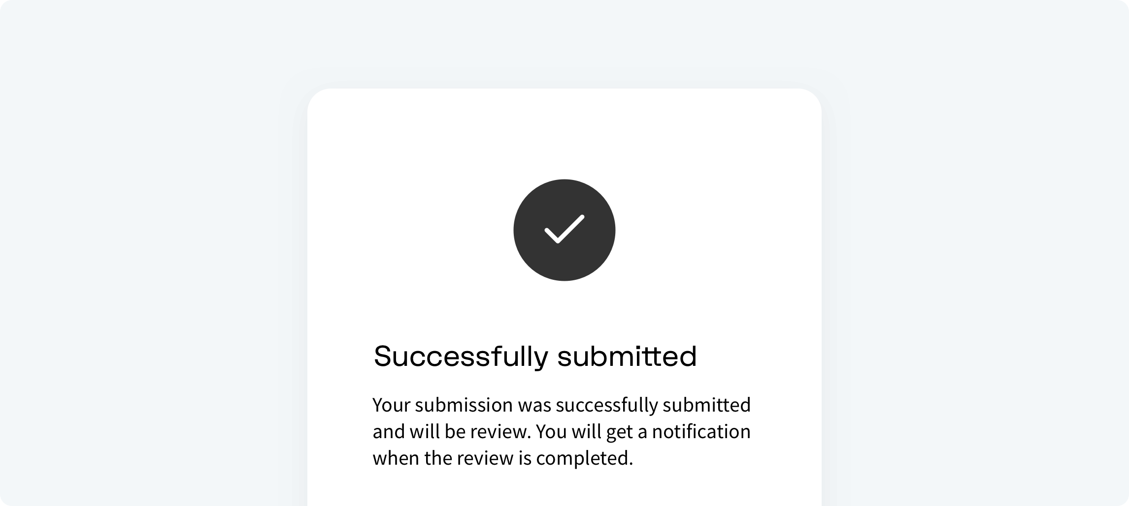
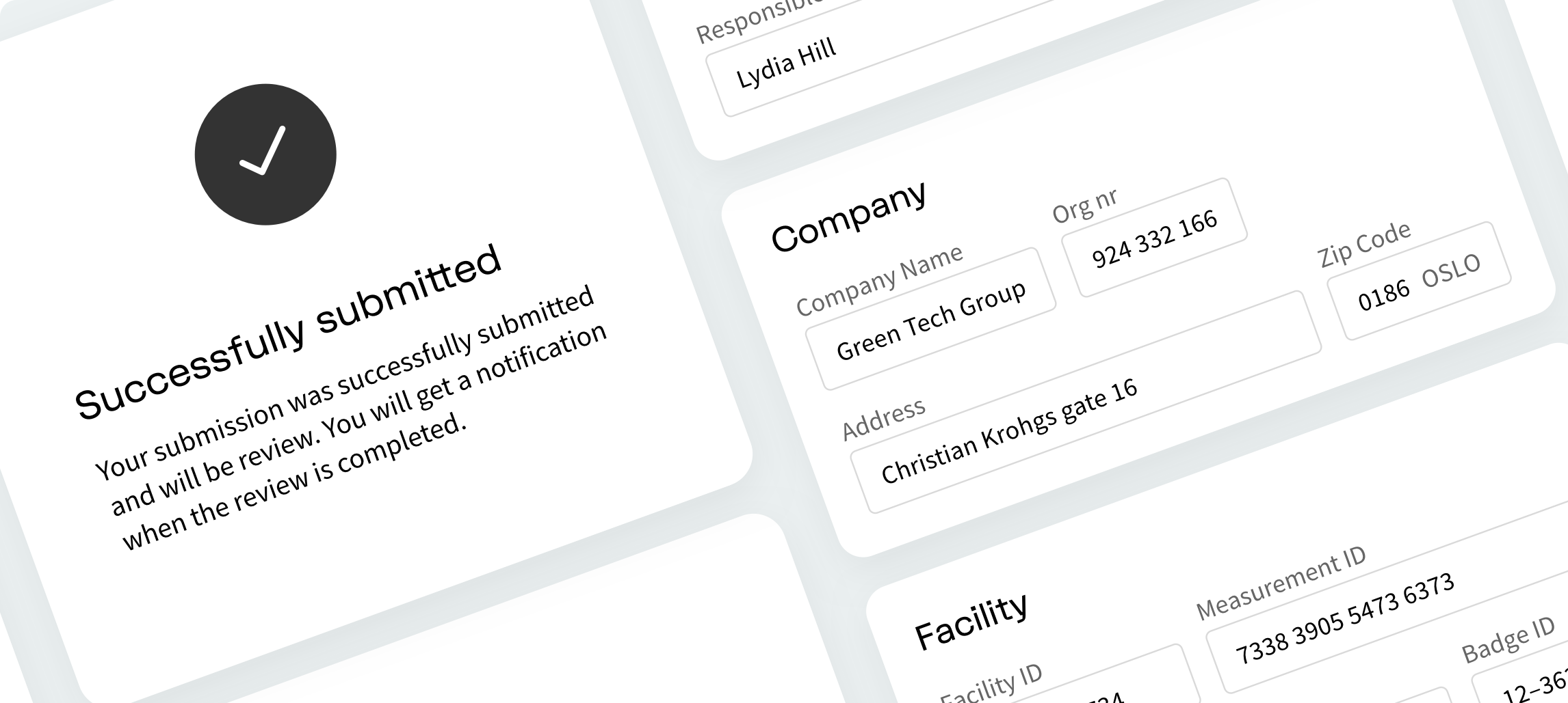
Success state#
Once the user has submitted a form, it is important to confirm what the submission was successful and display a completion message, explaining what the user can expect to happen next. At best, failure to do this means the user is left without a sense of completion. At worst, it could mean the user try’s to submits the form again. For example, at the end of the application flow, a message informing the user that the form is sent for approval.