Input
Input fields#
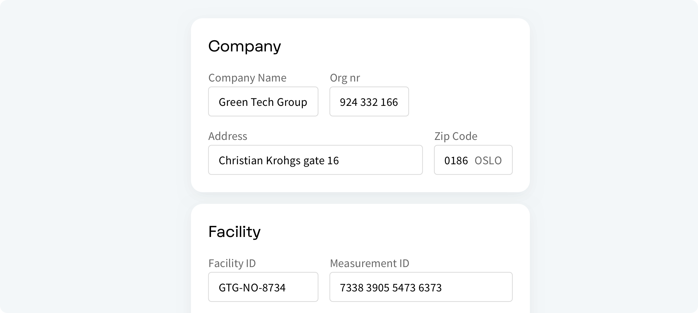
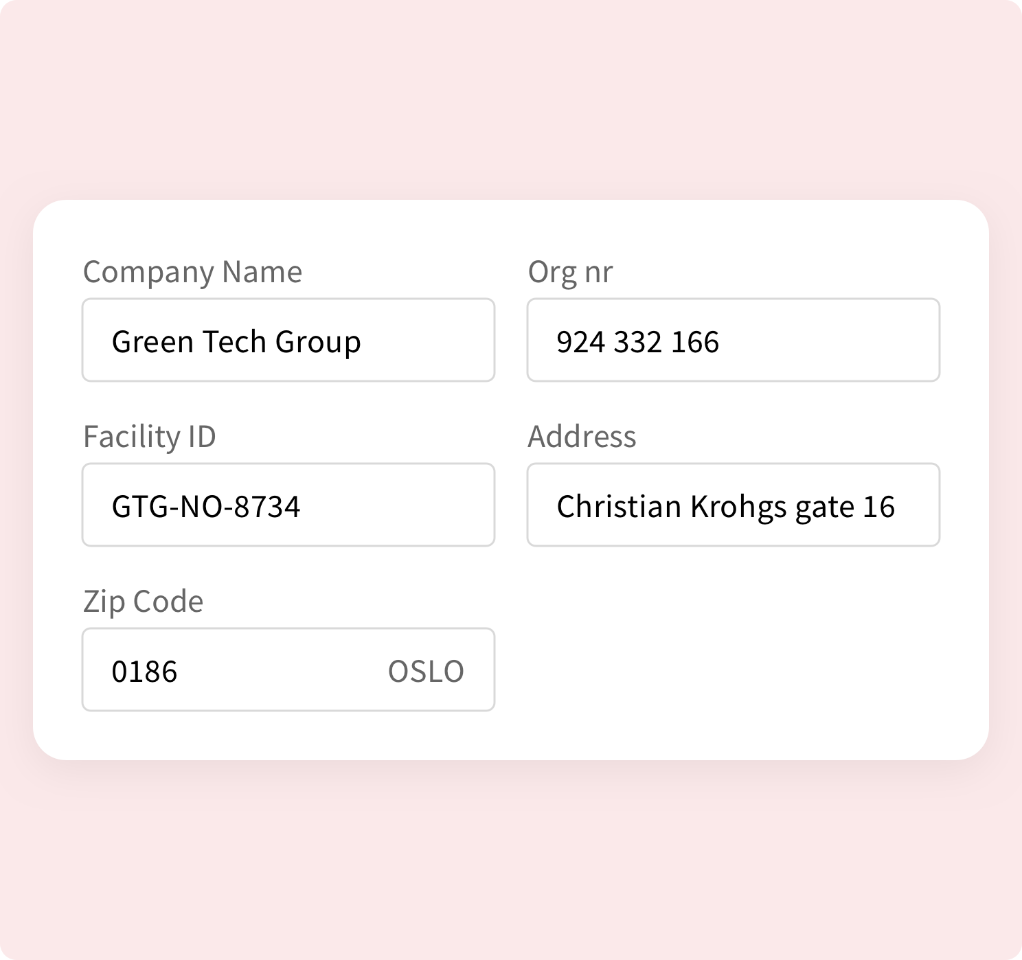
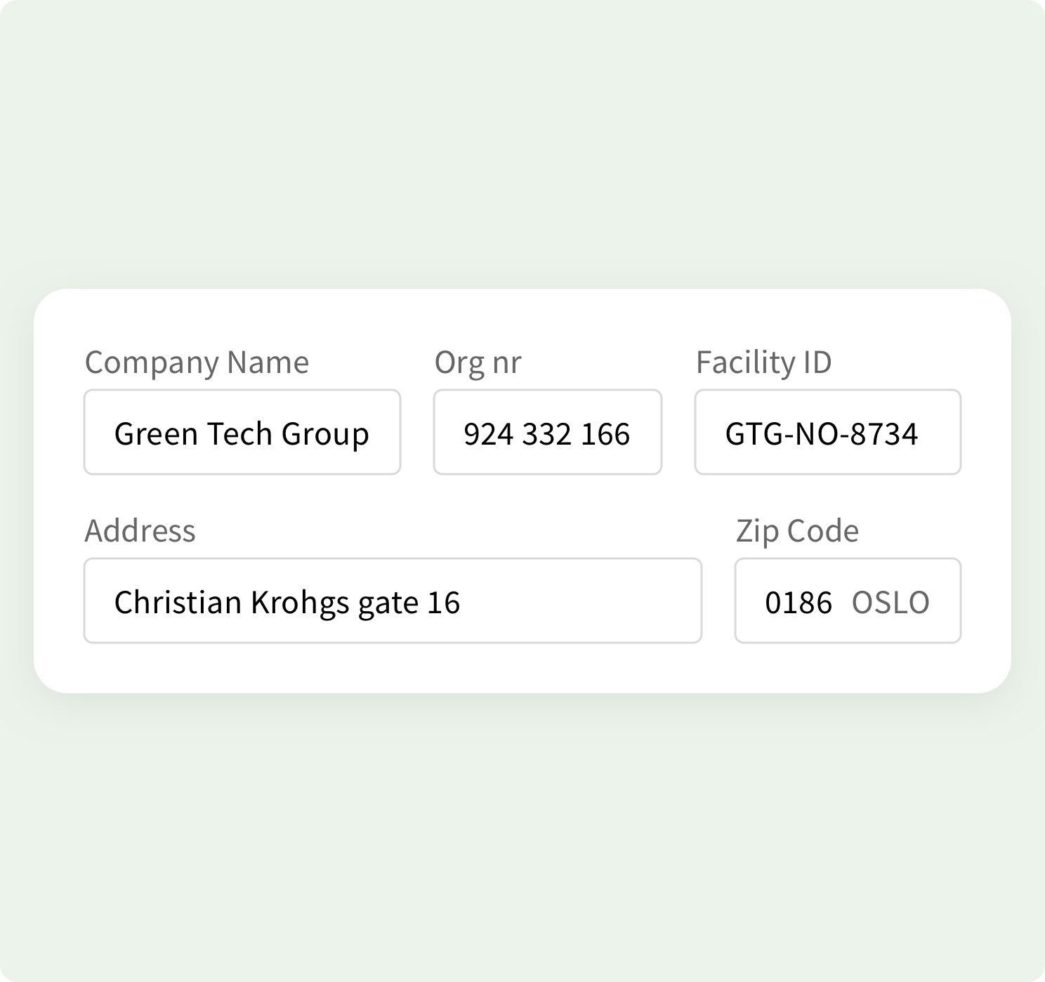
Input fields are what enable users input data in a form. Various types of fields exist to best gather the right data. It is important to use the right type of input field when requesting data. The right input field will help user input the information correctly, prevent mistakes, making the process easier. The length of the text field should be proportional to the expected data input.
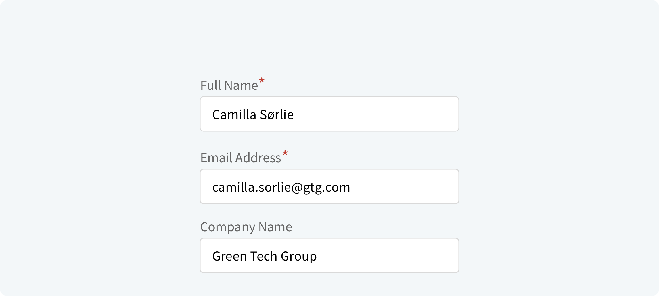
Mandatory and optional inputs#
Try to avoid optional fields in forms. However, when using them clearly distinguish which input fields are optional. The convention is to use an asterisk (*) for required fields or the word “optional” for non-required fields (which is preferable in long forms with multiple required fields). If deciding to use an asterisk for mandatory fields, show a hint at the bottom of the form explaining what the asterisk is for.
Default values#
It’s better to avoid setting default values unless we believe a large portion of your users will select the same values. People scan online forms quickly, and they don’t spend much time parsing through all of the choices. As a result, they can easily skip something that already has a value.
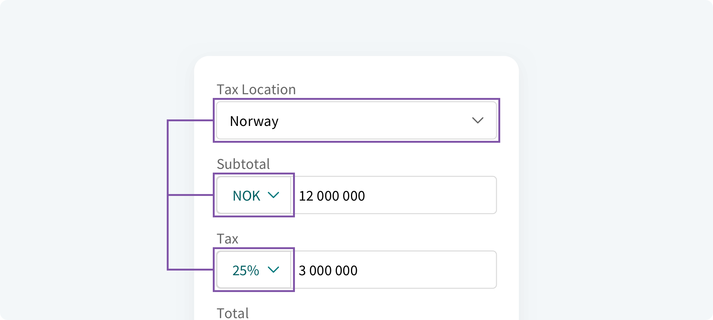
However, if we use smart defaults, which are pre-set values based on available information. Smart defaults can make form completion faster and more accurate. Still, use smart defaults with caution, as users tend to leave preselected fields as they are.
Help users#
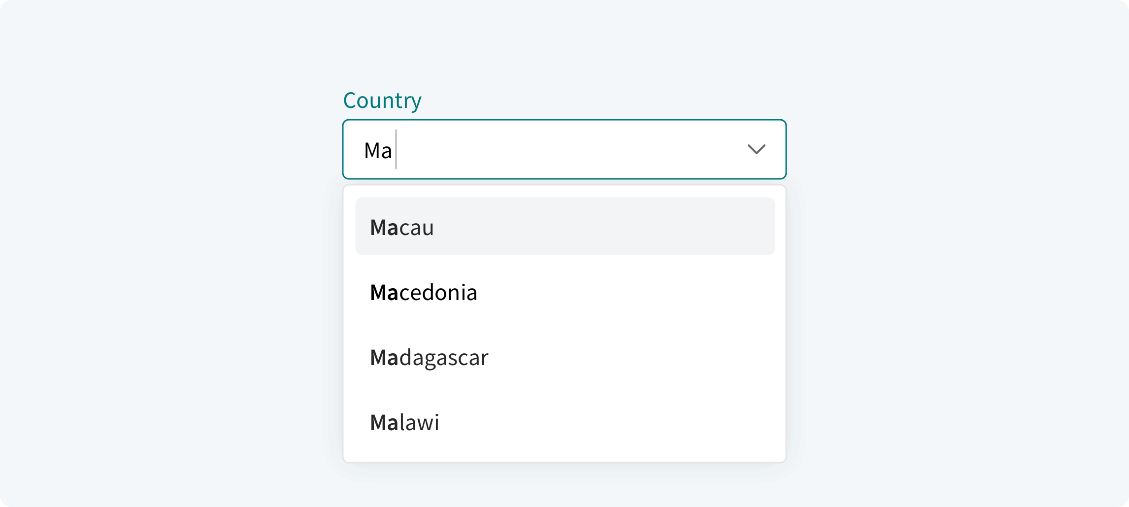
We should strive to help users input the information as correct and efficient as possible. Using functions as Auto-Complete, Auto-Fill, Auto-Suggest and Smart Defaults is a good way to help the user complete their tasks.
Validation and error#
As there are different goals of the validations, we should always review what kind of feedback is needed to help the user proceed and then design the interaction accordingly
Instant Validation#
At times, it is crucial to promptly display an error when it happens to avoid incorrect input and unnecessary effort. If a user inputs characters that do not correspond to the correct format, we should immediately inform the user that their input is invalid. Sometimes disabling a "Next" or "Submit" button until all validation is passed is an option. Examples of instant / real-time could be a password strength meter, or the character count limit.

Late Validation#
Sometimes late validation is appropriate to make sure we do not prematurely show an error. Let the user finish typing the data in the input field and only validate when the user leaves the input field.

Validate on Submit#
Not all errors are equally crucial, and it often is more of an annoyance to point out errors prematurely. To reduce annoyance, we can validate on submit. This will then be a clear indication to the user of where the incorrect input is and help the user proceed.

Labels#
Written labels are one of the primary ways to make a user interface more accessible. A good label tells the user the purpose of the field, maintains its usefulness when the focus is on the field itself and remains visible even after the field has been filled in.
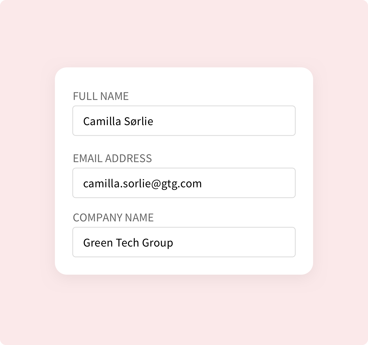
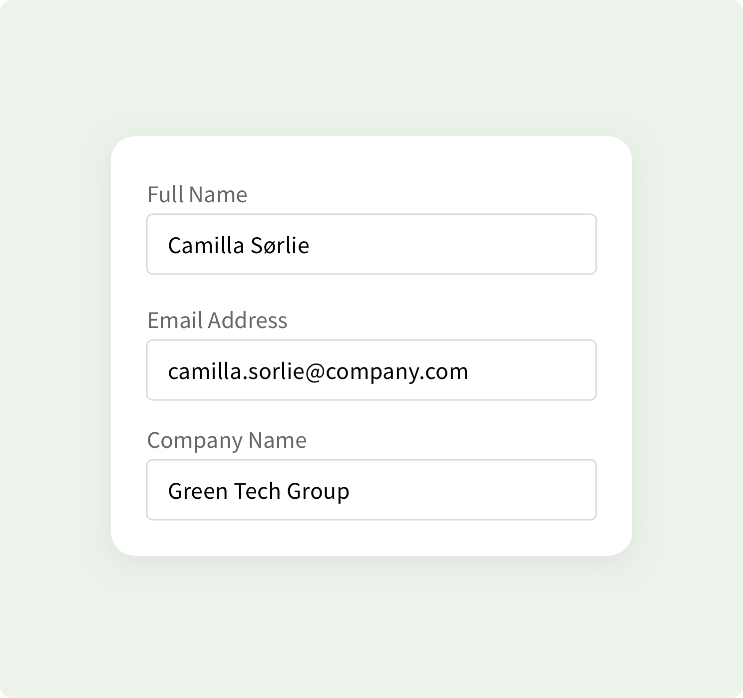
Use short and descriptive labels so that users can quickly scan the form. In most cases we recommend using text labels with title case, where we capitalize the first letter in every word, “This Is Title Case”. The advantage is slightly easier and faster to read. For longer labels sentence case is better, where only the first letter in the sentence is capitalized, “This is a sentence case”. Never use all caps, as this will make the form much harder to read, as there is no variation in character height
Radio, Checkboxes and Toggle Buttons#
| Radio Buttons | Checkboxes | Single Checkbox | Toggle Switches | |
|---|---|---|---|---|
| How many options are available? | Multiple | Multiple | 1 | 1 |
| How many selections can the user make? | 1 | 0 - all | 2 (on/off) | 2 (on/off) |
| Is there a default option? | Yes | No | Yes | Yes |
| How would you describe the choices? | Mutually exclusive | Independent of each other | Mutually exclusive | Mutually exclusive |
| When does the selection take effect? | After a user clicks a submit button | After a user clicks a submit button | After a user clicks a submit button | Immediately |
To learn more check out Nielsen Norman Group articles Checkboxes vs. Radio Buttons and Toggle-Switch Guidelines
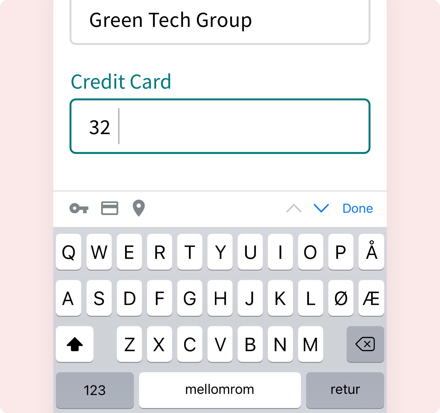
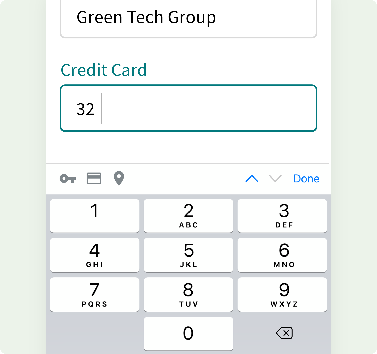
Tablet / Mobile#
As tablet and mobile devices have several different keyboard types it is highly recommended to trigger the right keyboard for the different input fields. Use OS native date picker and special inputs. If the user needs to input a password, don’t auto-hide the text. For longer forms they should be considered divided into smaller steps. The functions for mobile / tablet devices should be consistent throughout the form and application.
Other information…#
- Make sure that the form can be navigated with a keyboard.
- Auto-focus on the FIRST field in the form.
- Disable the proceed button if not all criteria are met.
- Allow user to copy and paste data.