Icons
Icons are essential to Volue's user interfaces. When used correctly, they communicate and help the users navigate, understand and utilize our solutions.
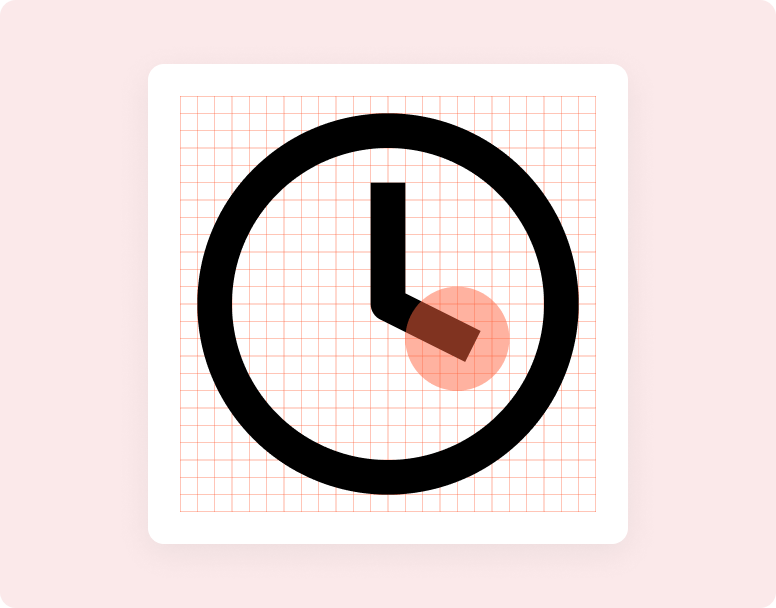
Overview
Our icon set is a subset of Feather Icons with some custom-made additions. It is a collection of SVG files, which comes with the following advantages:
- They’re vector graphics that can be infinitely scaled.
- SVG images can be inlined right in the document and thus styled with CSS or even manipulated with JavaScript.
- It is possible to create single SVG sprite sheet and reuse shapes without duplication.
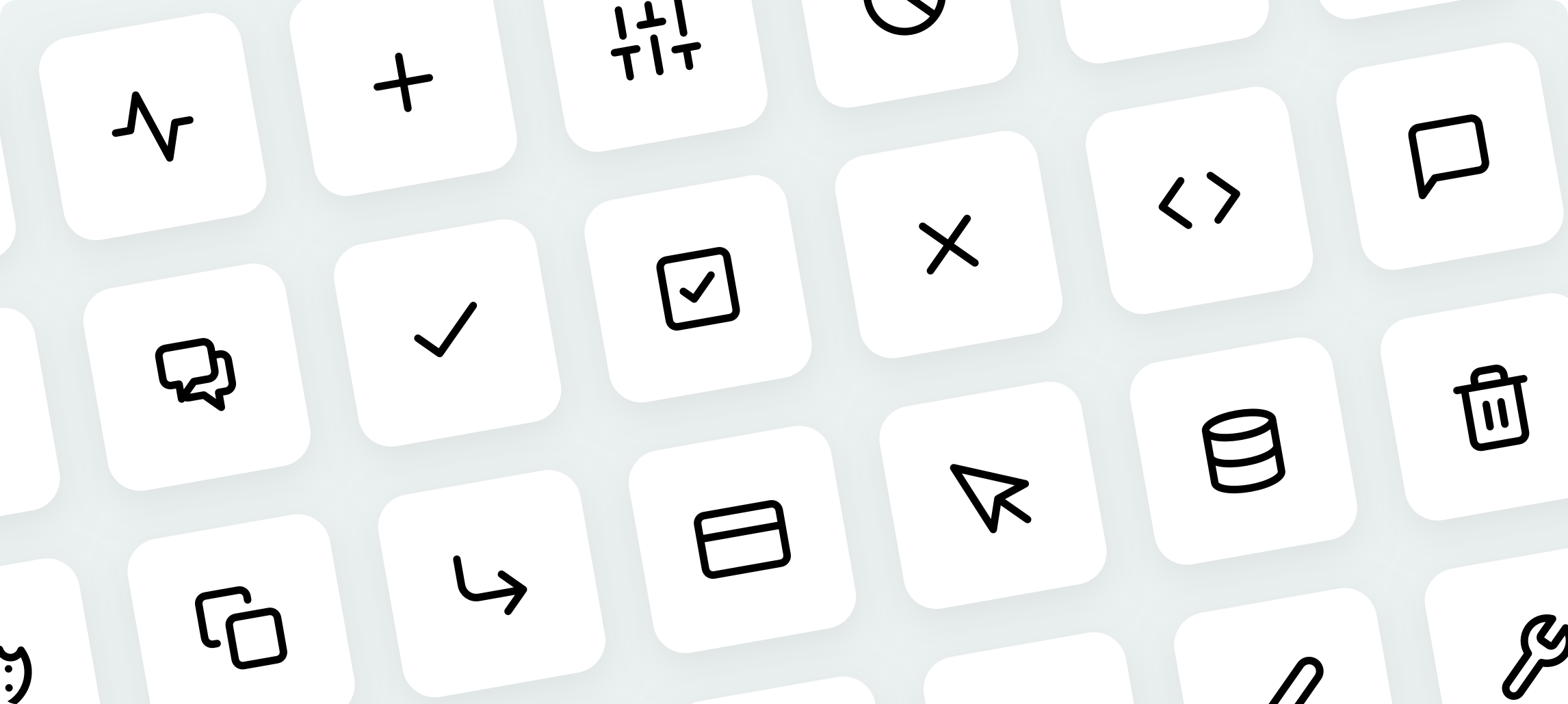
Browse icons#
Usage#
Include the SVG sprite in your app#
An SVG sprite is a single SVG file that contains data for multiple SVG graphics.
Sprite that comes with all the available icons is distributed together
with @volue/wave core package. Once installed, the sprite file can be found
at node_modules/@volue/wave/dist/core/sprite.svg.
It is also included in
@volue/design-icons package along with other files containing
icons data. See readme.
To use the icons, the sprite markup has to be embedded in your index.html file at the top of <body>.
In a webpack settings it's recommended to use raw-loader to achieve this:
<!DOCTYPE html><html><head><title>My App</title></head><body><div id="svgSpritePlaceholder" class="is-hidden" aria-hidden="true"><%= require('!!raw-loader!@volue/wave/dist/core/sprite.svg').default %></div><div id="root"></div></body></html>
It is also possible to inject the sprite in a React component:
import svgSprite from '!!raw-loader!@volue/wave/dist/core/sprite.svg';const Document = () => (<Html><Head /><body><divid="svgSpritePlaceholder"className="is-hidden"aria-hidden="true"dangerouslySetInnerHTML={{ __html: svgSprite }}/><Main /></body></Html>);
Use SvgIcon component#
Once the sprite is embedded, it's a breeze to use the icons thanks to the SvgIcon component:
import { svgIcon } from '@volue/wave-react';const AddIcon = () => <SvgIcon iconName="add" />;
To read more about the SvgIcon, visit the component page.
Custom sprites builder#
If you need to build a custom SVG sprite sheet from individual SVG icons, you can use the tool available in the old docs.
Icon design guidelines#
Icon grid ingredients#
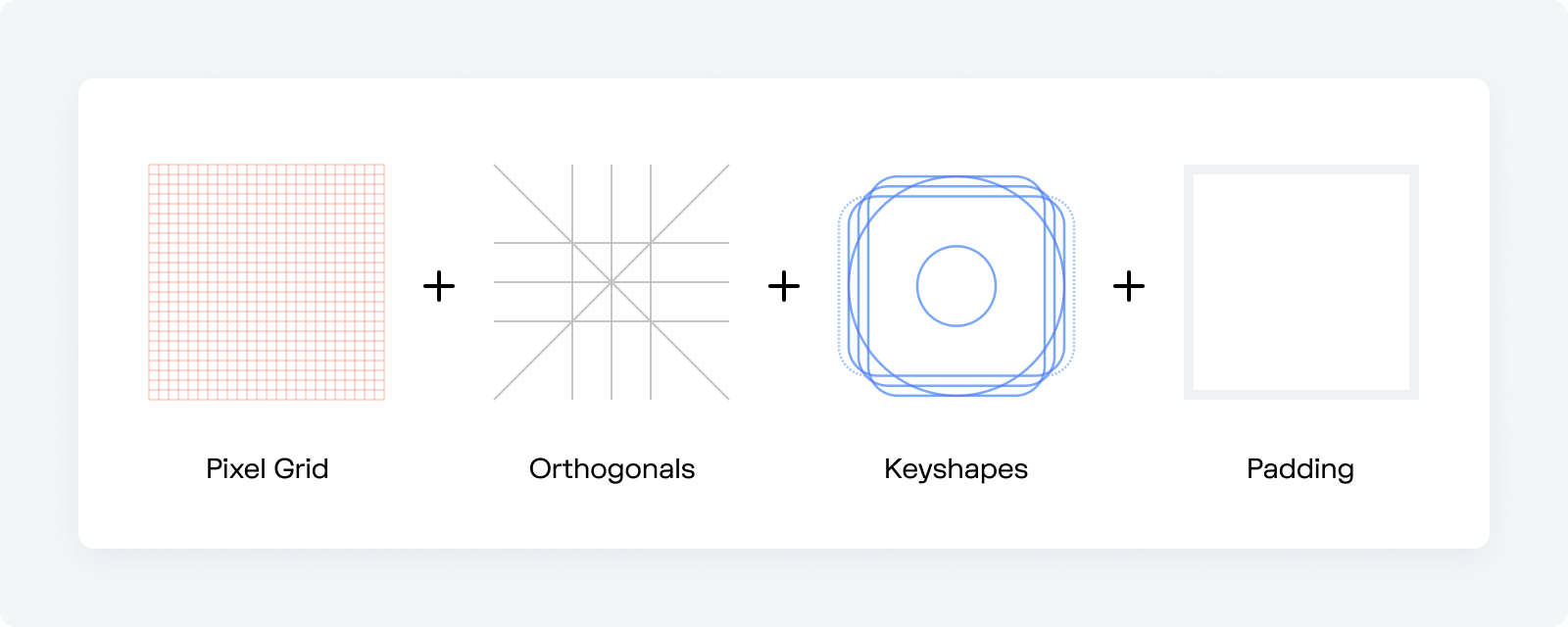
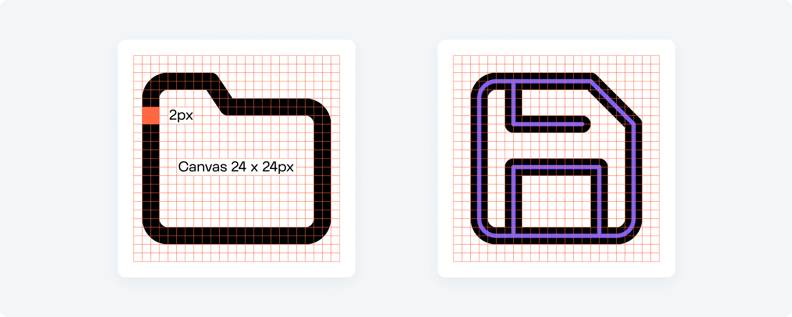
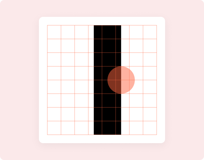
The icon grid provides a structured base for our icons. The foundation of the final grid is a pixel grid — which means that each square of the grid maps directly to a single pixel on a computer screen. Wave icons are drawn on a 24px x 24px canvas and scaled linearly to different sizes. The primary building block is a 2px centered stroke.
When building icons, you always want to align objects to the pixel grid, especially straight lines. This way you'll ensure the design remains crisp. Also, spacing things evenly is much easier when you're using a grid. It helps you stay consistent with your placement, and overall makes the icons look better.
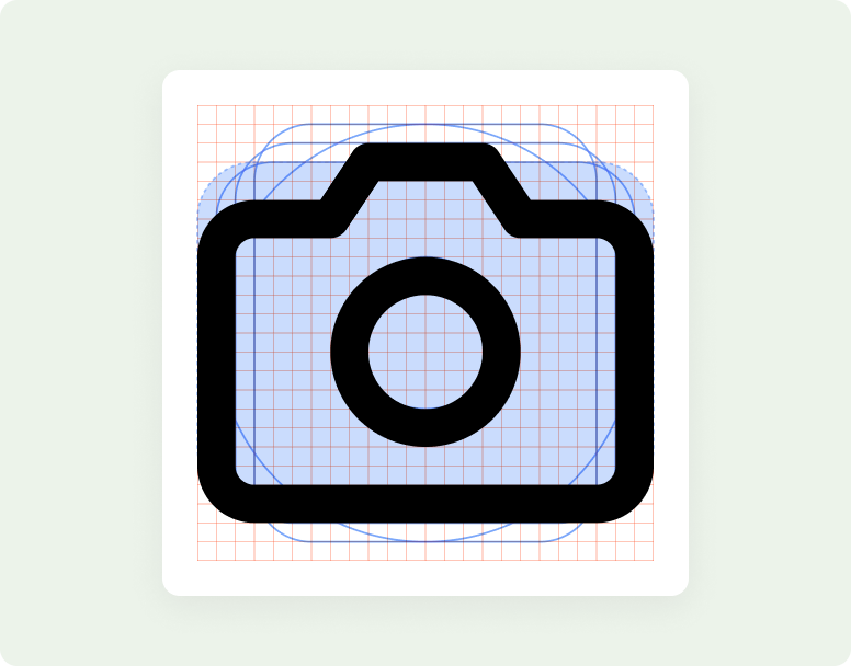
Keyshapes#
Another important ingredient of the icon grid are keyshapes. Keyshapes provide template shapes to start from: a circle, square, portrait rectangle, and landscape rectangle. They ensure that each icon takes up a similar amount of volume, regardless of its overall shape, which helps ensure that icons retain a similar optical weight.
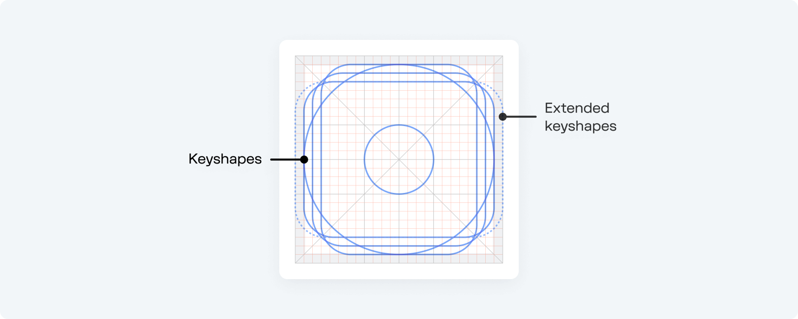
Each shape has different dimensions, but they all have a similar visual balance. Use key shapes as the basic building block for icon consistency.
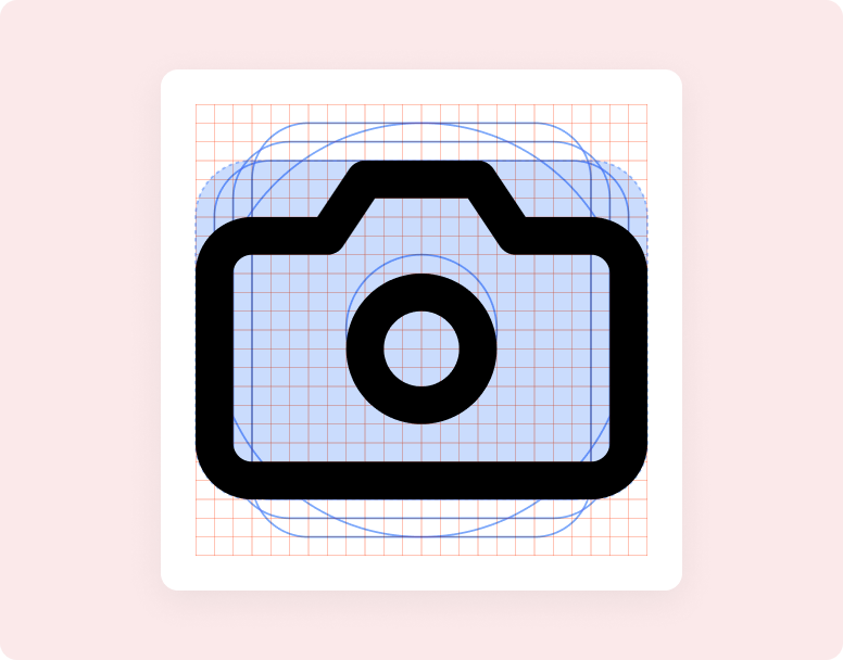
See how keyshapes translate into some icon glyphs:
Keyshapes are just guidelines of course, sometimes you may need to extend beyoned the keyshapes for proper form. Drop the guidelines when they stop working for you.
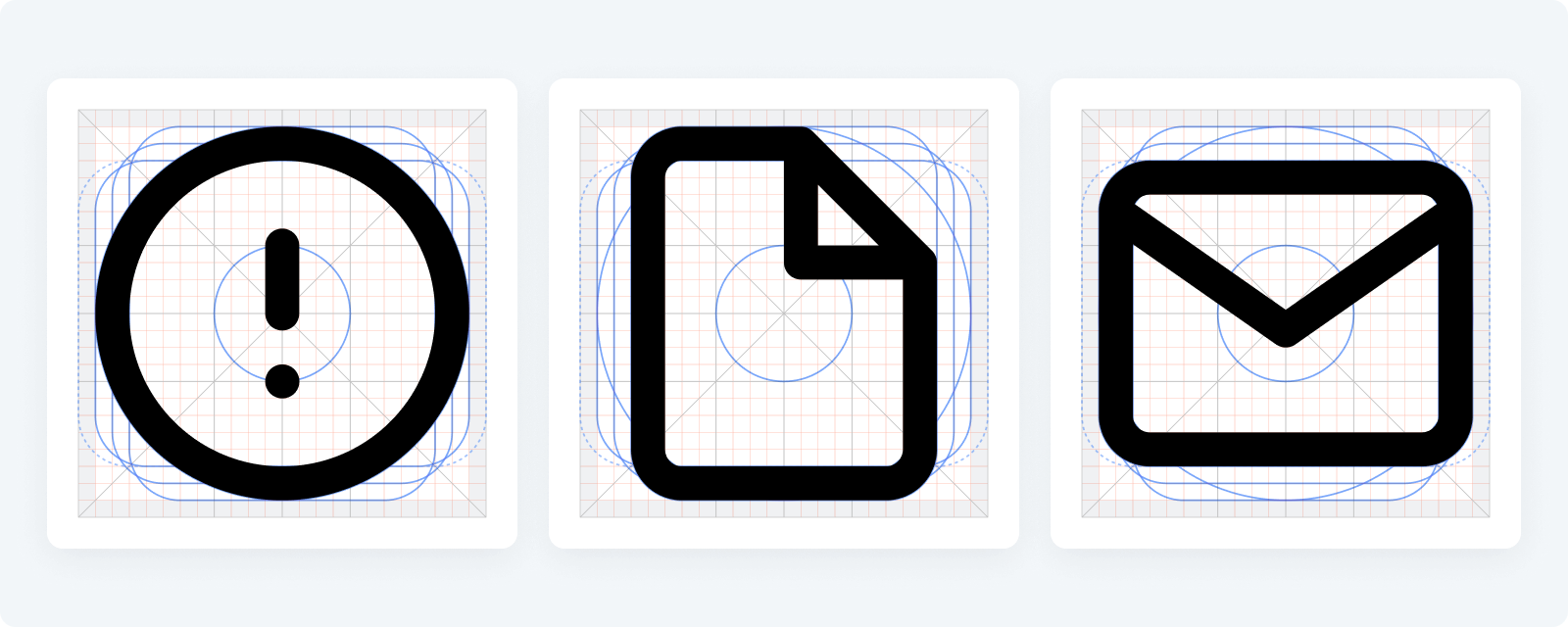
Final grid#
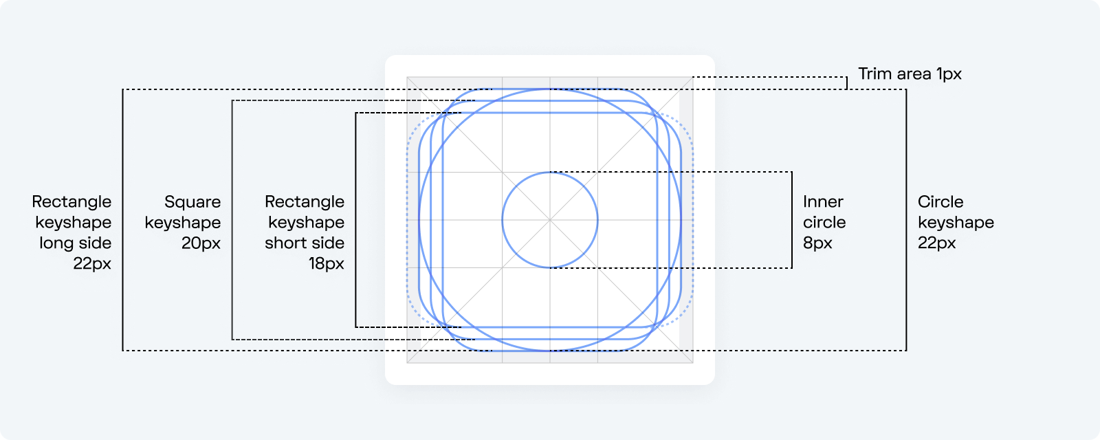
Other elements of the grid include orthogonals and padding / trim area.
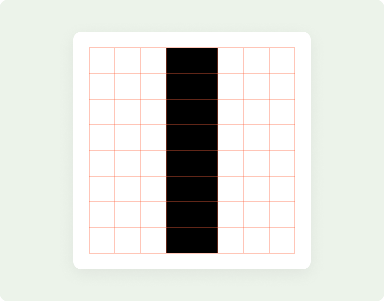
Orthogonals referer to keylines that intersect the center point of the icon. They slice the canvas at 90° and 45°. Make sure to align slashes to a 45° orthogonal. 45° angles are best (after straight lines) because the pixels used to define the angle are stacked, or stepped diagonally.
Padding is the area reserving the outer 1px for visual weighting. Padding is a soft guidance and sometimes you may need a wider shape that extends to the edges of the canvas.
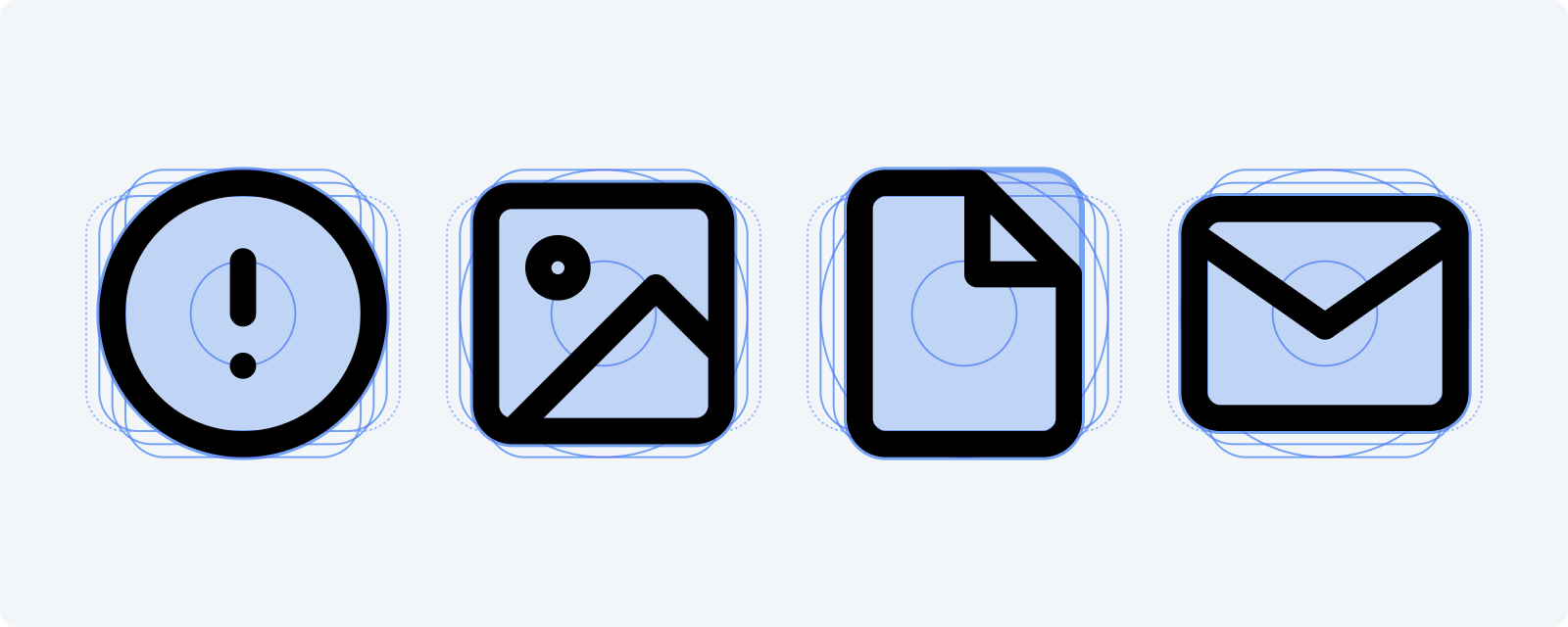
Take a look at some of the icons placed on the final grid:
Strokes & rounding#
Wave icons are created with a 2px centered stroke to create a sense of lightness. Be consistent with 2px stroke to maintain the same visual weight for all icons.
Object corners are primarily rounded by 2px, except in some cases where a larger radius makes sense to better reflect the real form of the object (like the bevels of a phone, or some exterior obtuse angles). The 2px radius can be increased by a multiple of two when necessary.
If you are juxtaposing two or more elements together (for example on top of each other), add a 2px stroke break/gap.
Use rounded stroke terminals and rounded line joins keep the icon smooth.
Adding new icons#
Ready to expand existing set with a new icon? Follow the guidelines above and use the icon template as a starting point for your new icon designs.