App layouts
App layouts describe the fundamental structure of an application. It defines the basic areas and explains roughly where which kind of content belongs.
There are two fundamental layouts:
- Header-based layout
- Sidebar-based layout
In most cases the header-based layout is recommended. The sidebar-based layout is only recommended for map based applications.
Header-based Layout (regular)#
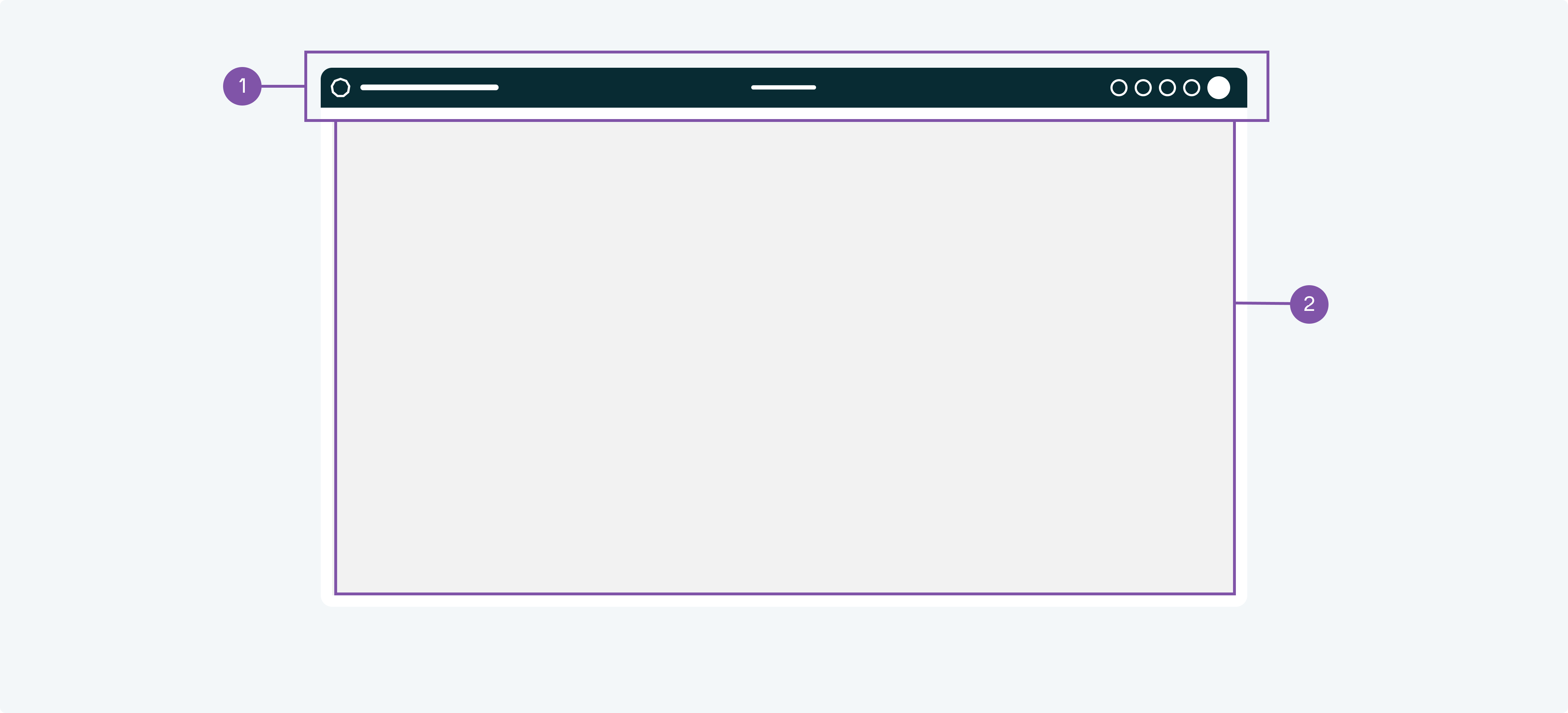
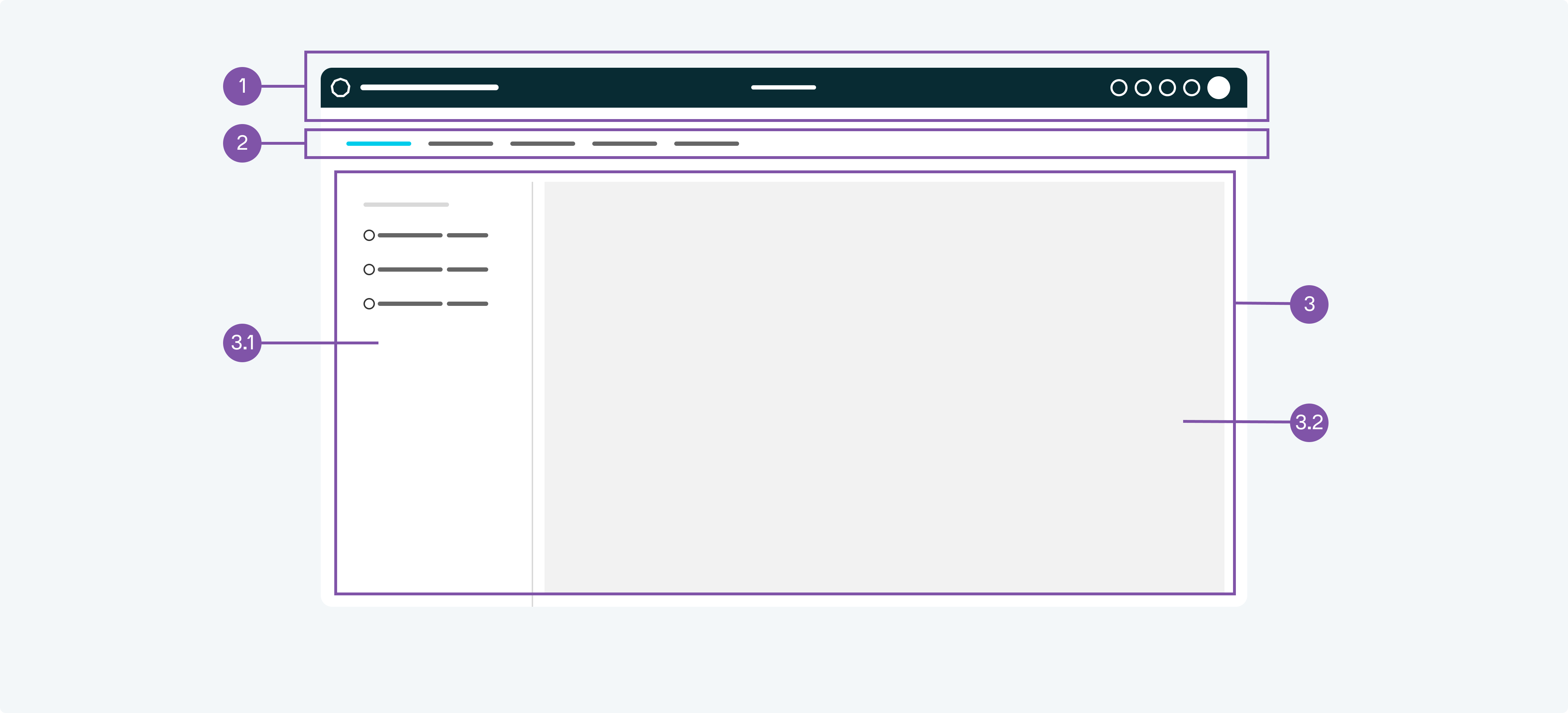
- Header
- Main container
- When to use
- Use for any regular application.
- Description
- The header serves as the main title of the application and as such carries basic information, such as branding, app title and connection status, it can also offer global features, such as user profile, settings and user manual.
The main container offers space for content, such as dashboards and landing pages. - Behaviour
- The header is at the top of the screen while the main container is below. When scrolling the header remains fixed and the main container scrolls underneath it.
- Components to use
-
-
With app bar#

- App Bar
- Header
- Main container
- When to use
- If you have a product that consists of multiple modules or a bunch of applications, this app bar serves as a navigation across them.
- Description
- The app bar offers a navigation to multiple modules or applications that open to the right of it.
- Behaviour
- The app bar can be considered to be on hierarchy level 1, the header is level 2 and the main container level 3. When scrolling the app bar and the header remains fixed and the main container scrolls underneath it.
- Components to use
-
-
-
With sidebar#
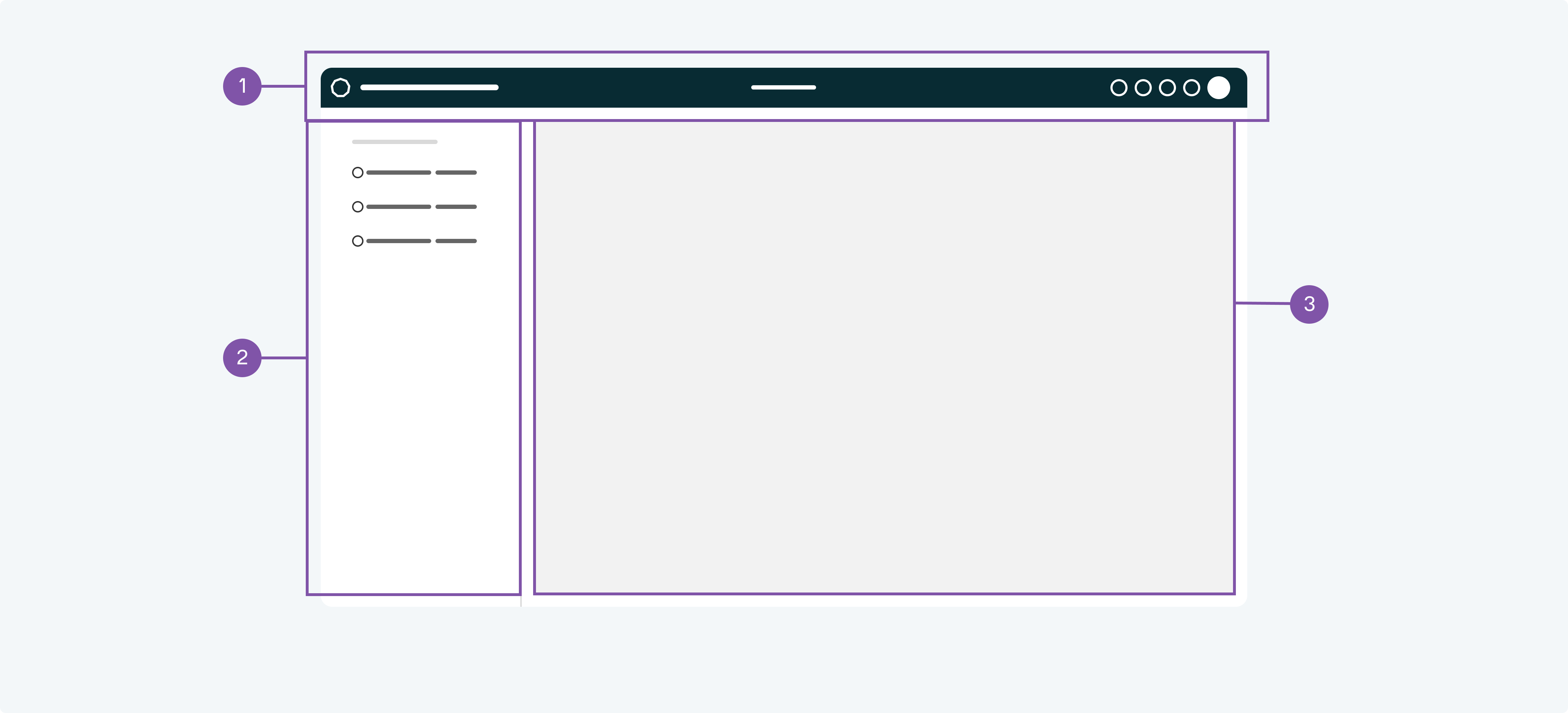
- Header
- Sidebar
- Main container
- When to use
- If you need to offer multiple pages of content: consider to use this kind of sidebar.
- Description
- The sidebar offers a navigation to multiple pages of content that open to the right of it.
- Behaviour
- The header can be considered to be on hierarchy level 1, the sidebar is level 2 and the main container level 3. When scrolling the header and the sidebar remains fixed and the main container scrolls underneath it.
- Components to use
-
-
-
With nav bar#
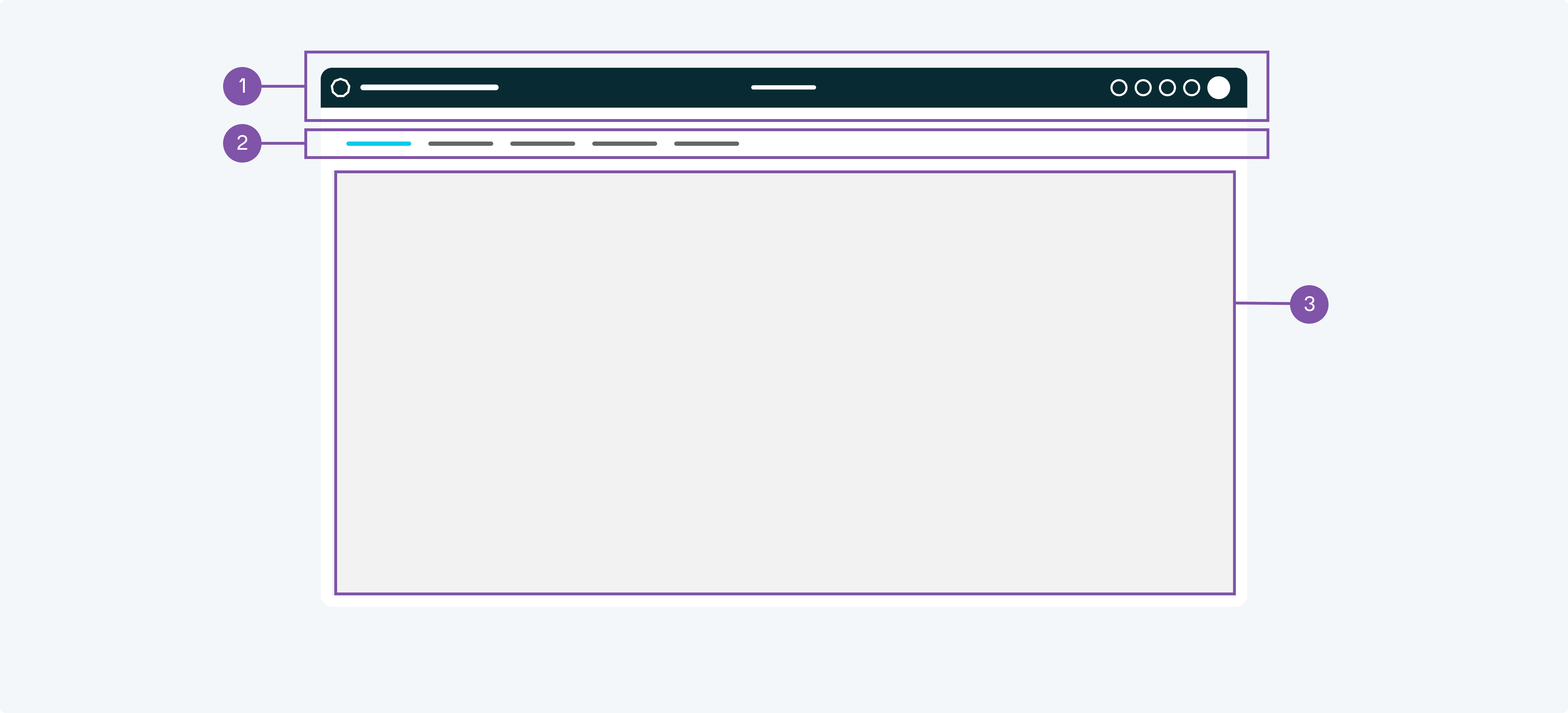
- Header
- Nav bar
- Main container
- When to use
- If you need to offer some multiple pages of content: consider to use the nav bar. This is recommended when you have only a few (e.g. less than 7) pages.
- Description
- The nav bar tabs offers a navigation to multiple pages of content that open below it.
- Behaviour
- The header can be considered to be on hierarchy level 1, the nav bar is level 2 and the main container level 3. When scrolling the header and the tabs remains fixed and the main container scrolls underneath it.
- Components to use
-
-
-
With nav bar and sidebar#
- Header
- Nav bar
- Content
- Sidebar
- Main container
- When to use
- If you have tabs and need to offer some multiple sub pages: consider to use this kind of sidebar.
- Description
- The tabs offers a navigation to multiple pages of content that open below it. Within these pages an additional sidebar can be used to give access to multiple sub pages.
- Behaviour
- The header can be considered to be on hierarchy level 1, the nav bar is level 2, the sidebar level 3 and the main container level 4. When scrolling the header and the tabs remains fixed and the main container scrolls underneath it.
- Components to use
-
-
-
-
- Demos
-
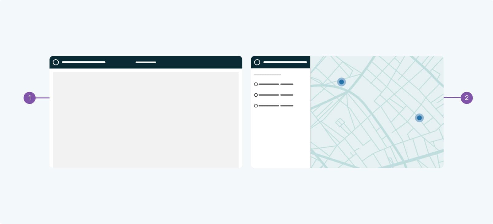
Sidebar-based layout#
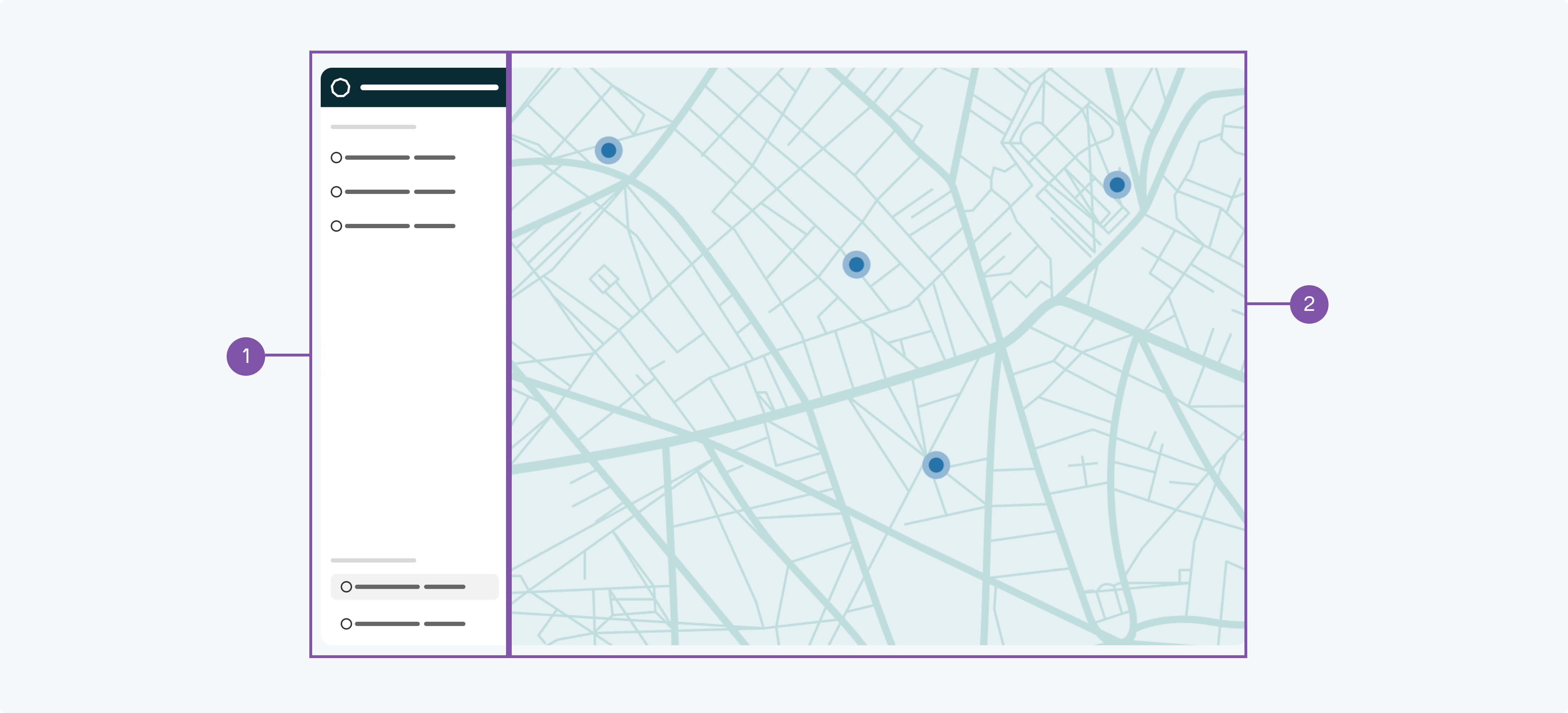
- Sidebar
- Main container
- When to use
- Use for any map based application.
- Description
- As an alternative to the header-based layout you may chose the sidebar-based layout. This is recommended for any map-based applications. The sidebar contains a little header which serves as the main title of the application. Global features, such as user profile, settings and user manual have to be added to the sidebar.
The main container offers space for content, such as maps, dashboards or landing pages. - Behaviour
- The sidebar is at the left of the screen while the main container is on the right. When scrolling the sidebar remains fixed and the main container scrolls underneath it.
- Components to use
-
-
With a header#
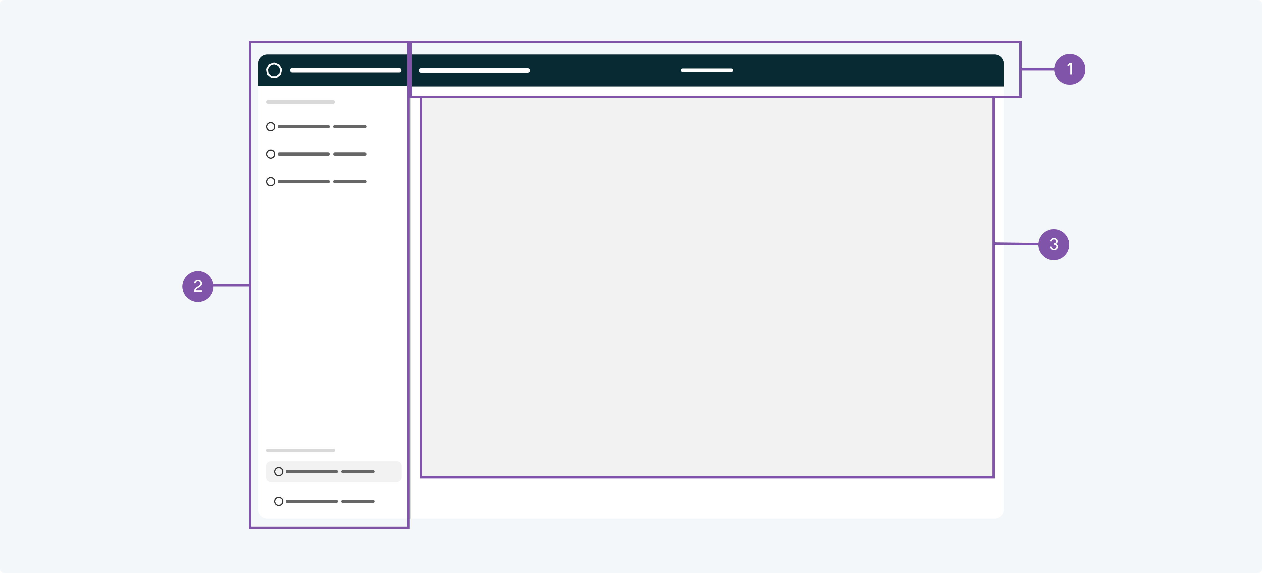
- Header
- Sidebar
- Main container
- When to use
- Use for any map based application that have an additional need for a header.
- Description
- As an addition to the sidebar-based layout you may chose to add a header. This is recommended for any map-based applications that require a header.
- Behaviour
- The sidebar is at the left of the screen, the header is on its right and at the top. The main container is on the right and bottom. When scrolling the sidebar and the header remain fixed and the main container scrolls underneath it.
- Components to use
-
-
-
Dialog#
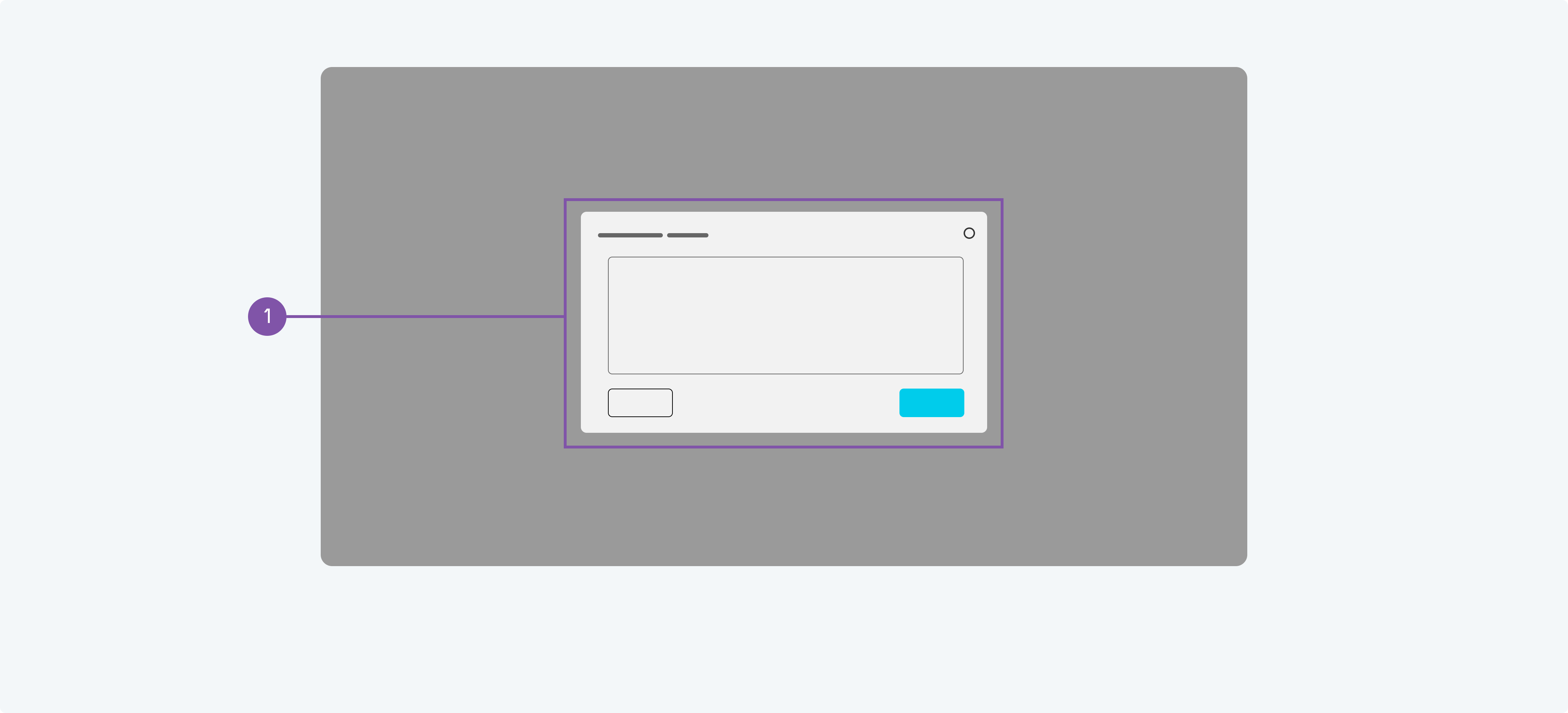
- Dialog
- When to use
- Use to show any temporary content, like messages, forms, inputs.
- Description
- In addition to the basic layout the dialog can be used to show any temporary content on top of the regular content.
- Behaviour
- Dialogs open above regular content. While a dialog is opened the underlying content should not be changed.
- Components to use
-
Drawer#
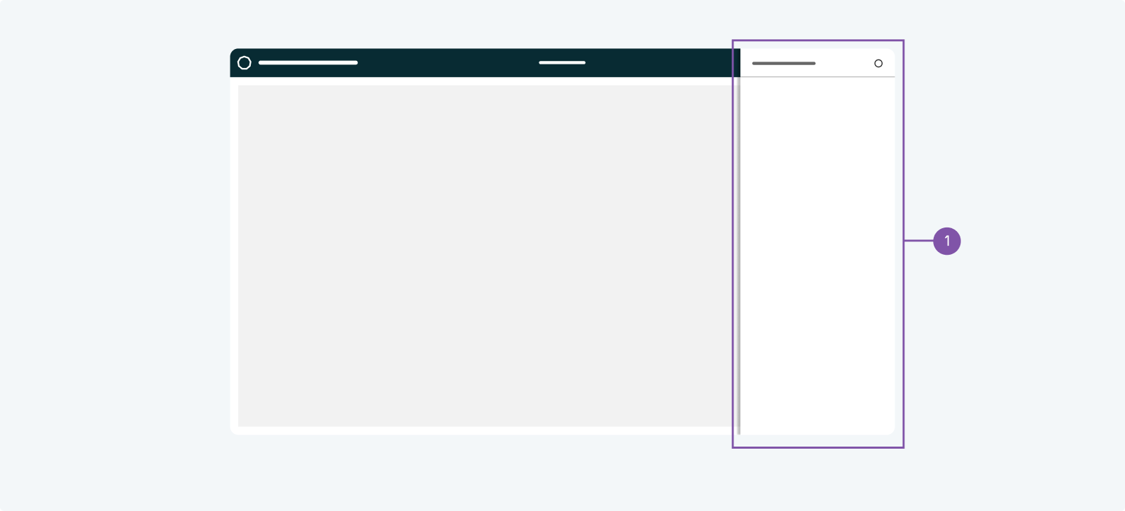
- Drawer
- When to use
- Use a drawer to temporarily show some kind of additional content. The content should not be too much and not too complex. Consider a proper pager otherwise.
- Description
- In addition to the basic layout the drawer can be used to show any temporary content on the rights (or left) side of the screen.
- Behaviour
- Drawers open above regular content and header. While a drawer is opened the underlying content should not be changed.
- Components to use
-