Button
A Button is a clickable element used to initialize an action.
Import#
import { Button } from '@volue/wave-react';
Examples#
Basic#
Variants#
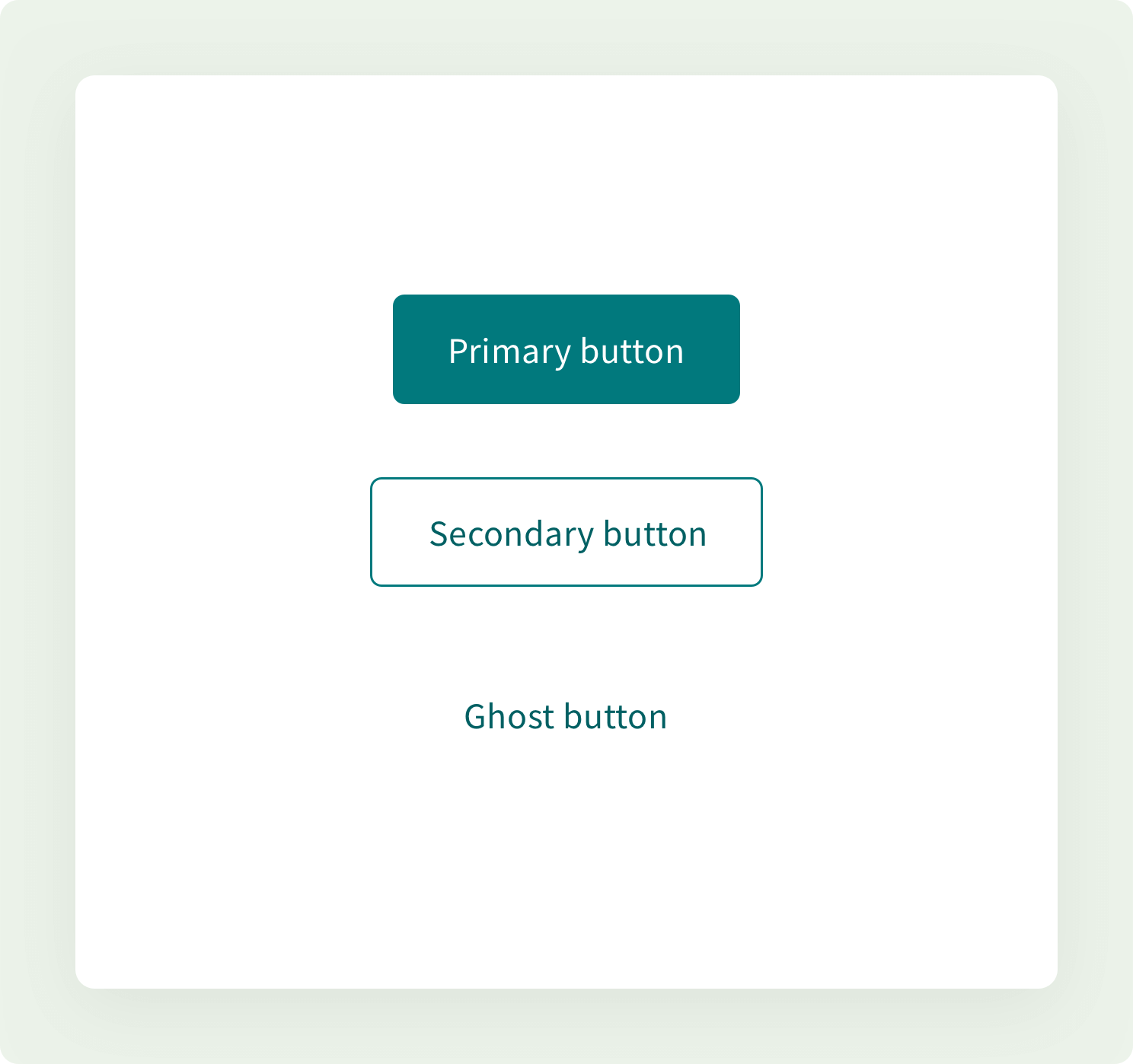
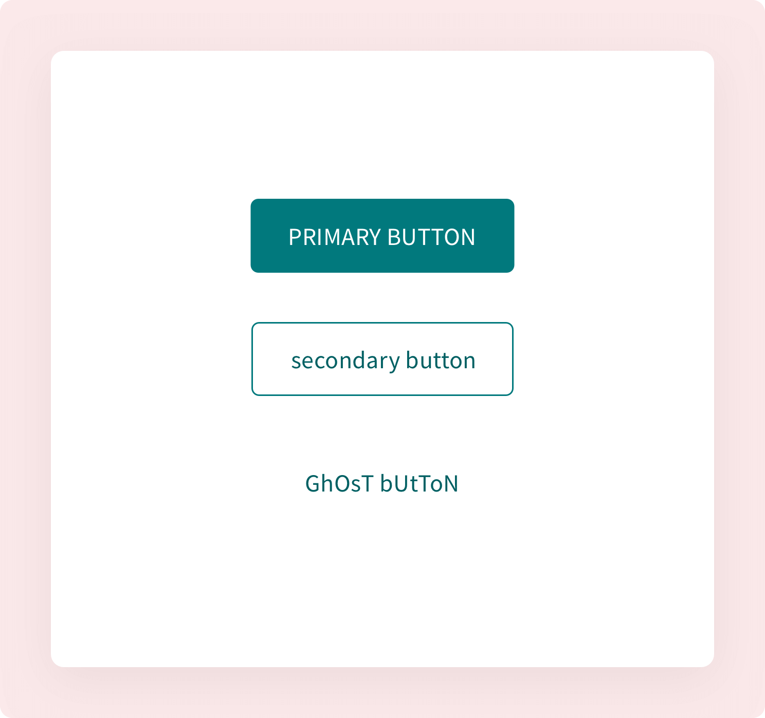
We provide buttons of three "visual" variants: strong (high emphasis), outline (medium emphasis) and ghost (low emphasis).
Sizes#
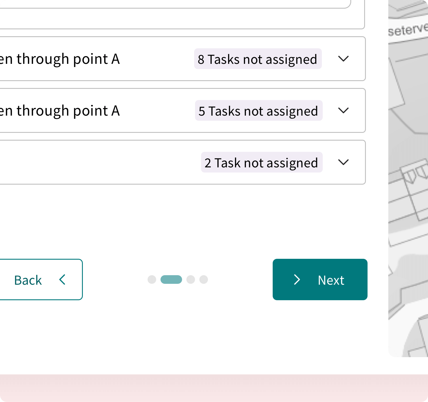
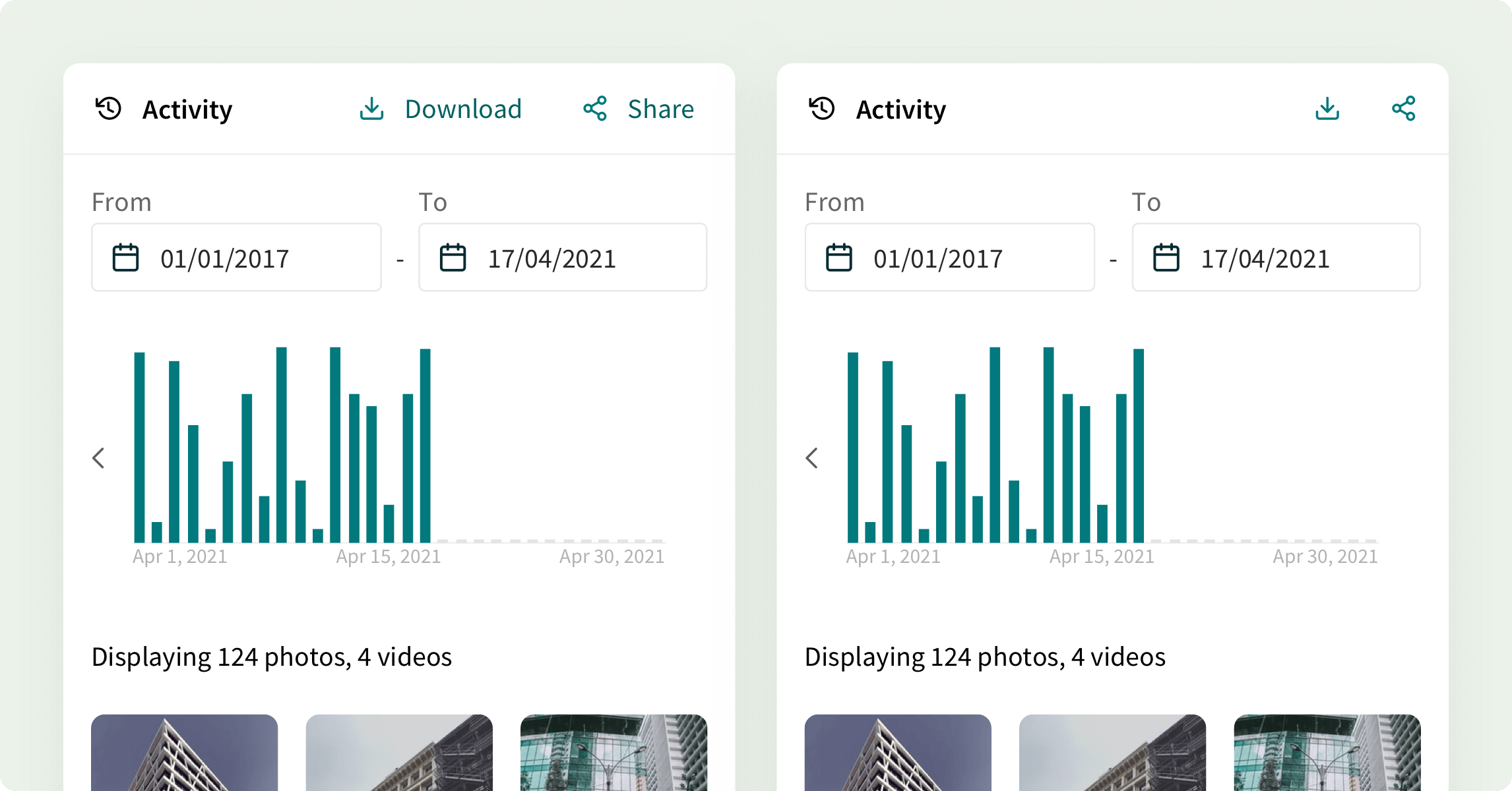
Wave provides two button sizes ‐ medium and small, with exception of lone icon buttons which can also be xSmall or xxSmall.
-
mediumsize buttons are used by default. -
smallsize buttons andxSmalllone icon buttons can be used in cases when there is limited space available for rendering, like in data tables or complex dashboards.
Responsive#
Button supports responsive syntax for its size property, which means you can change its size based on the viewport.
Multi-sizing#
Wave provides applySizes utility, which lets you specify size "scopes" within your app.
import { applySizes } from '@volue/wave-react';
All buttons within a scope will share the same size unless overwritten on a per-control basis.
Color scheme#
You can theme the buttons using color prop.
Different button color schemes have special purposes that are indicating specific actions to the users. Check the guidelines below for details.
Accent (default)#
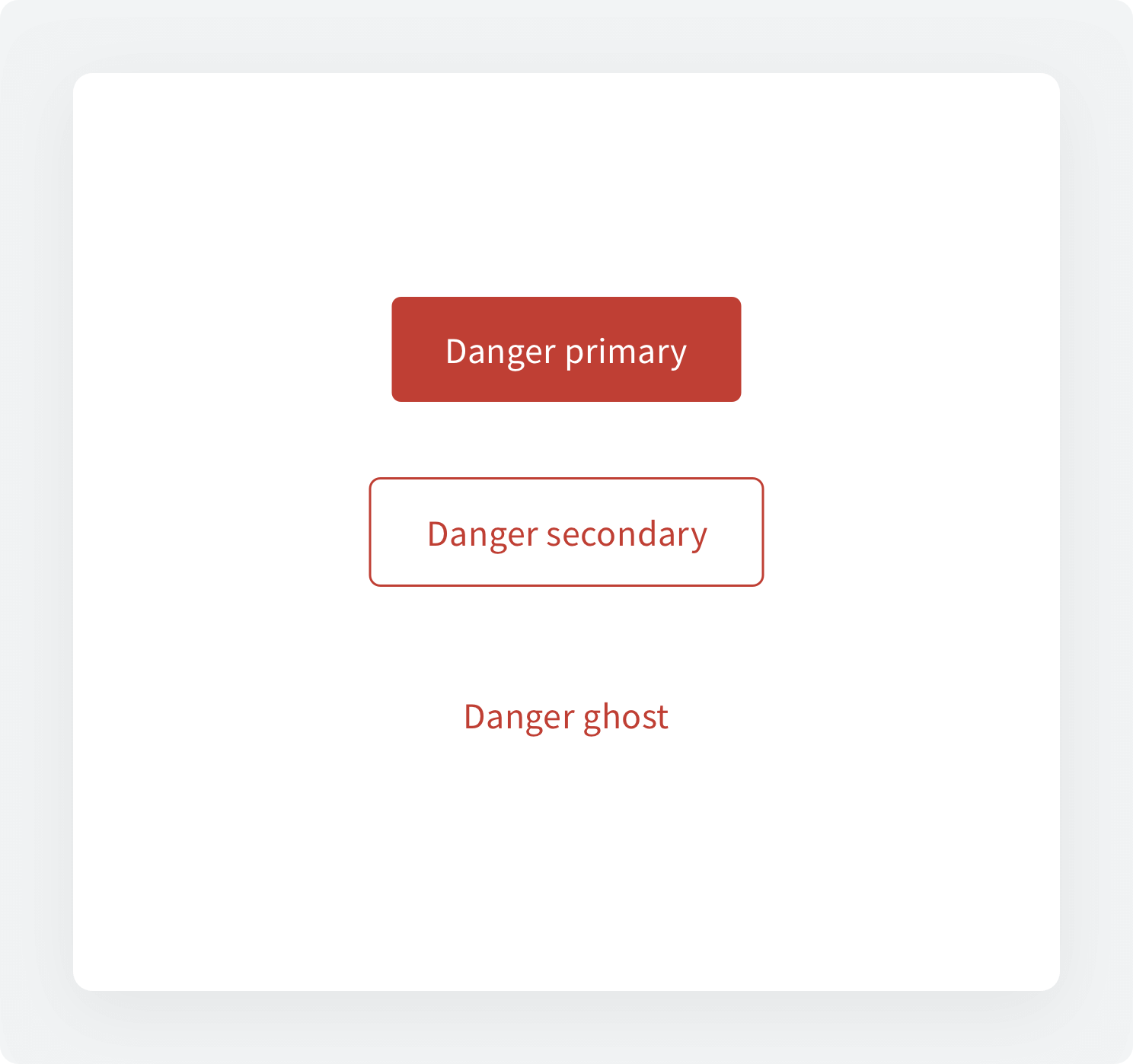
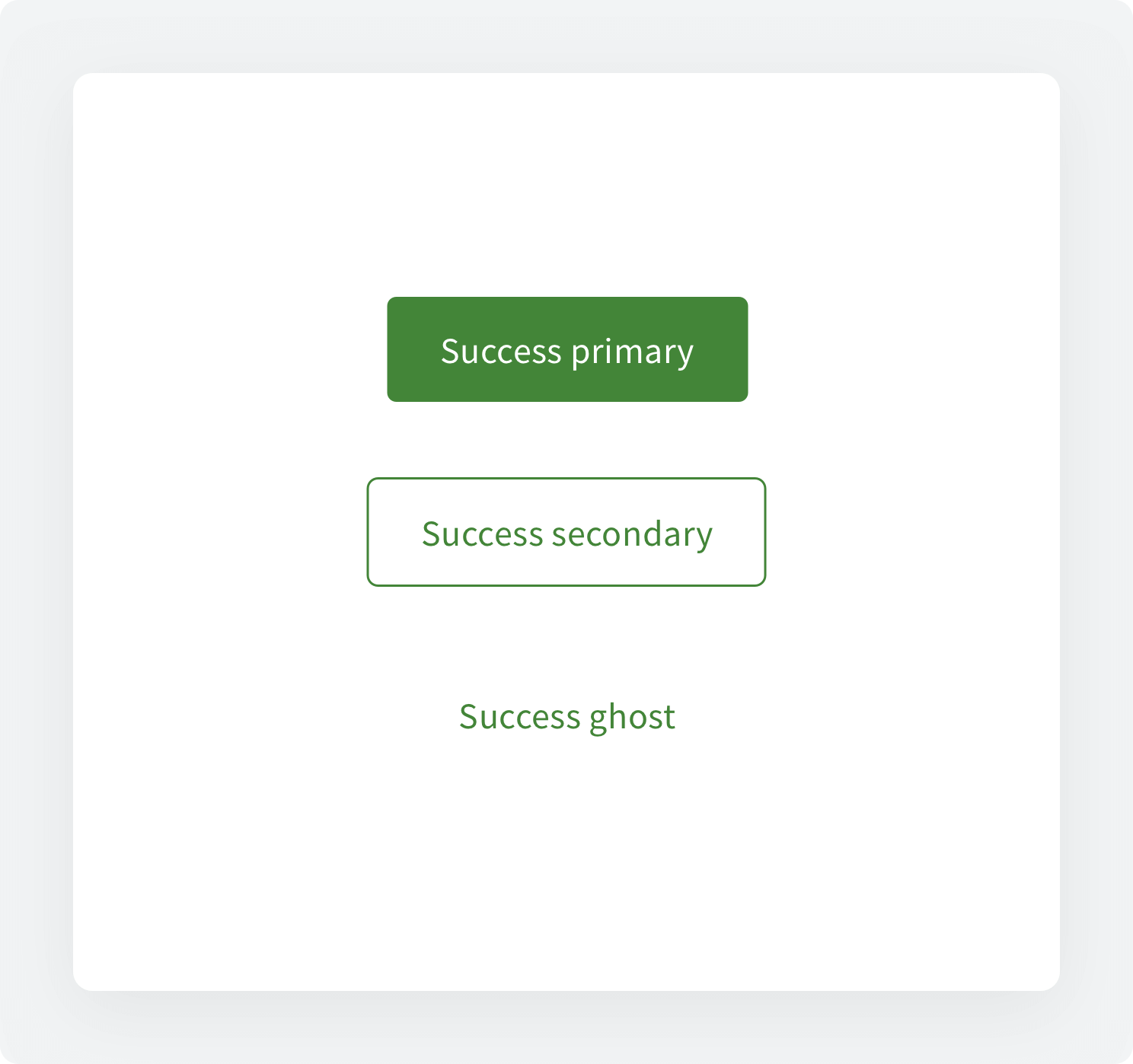
Success/Danger#
Inverse (white)#
Button with icon#
You can add left and right icons to the Button component using the leftIcon and rightIcon props respectively.
Icon only button#
Buttons may include an icon without a label. Icon only buttons work well in compact spaces.
Please provide aria-label prop to support assistive technology (i.e. screen readers) or wrap the button with a tooltip.
Button states#
Disabled#
Each button may be displayed as disabled.
Loading#
Pass the isLoading prop to show button in a loading state. By default, the button will show a spinner and leave the button's width unchanged.
You can also pass the loadingText prop to show a spinner and the loading text.
As link#
Elements that are visually equivalent to buttons but change the URL and link to a new experience should be rendered as HTML anchor tags. Provide an as prop, and the button will render as an anchor tag.
as prop allows you to change the component to a different HTML tag or custom component (so called polymorphism).
This will merge the original component props with the props of the supplied element/component and change the underlying DOM node.
You can now pass extra props to the underlying <a> element such as href etc. and it's perfectly type-safe 🎉
API Reference#
Prop | Type | Default |
|---|---|---|
as | enum | button |
css | StitchesCss | No default value |
variant | enum | "strong" |
size | enum | No default value |
color | enum | "accent" |
leftIcon | React.ReactElement | No default value |
rightIcon | React.ReactElement | No default value |
withLoneIcon | boolean | false |
shape | enum | "default" |
isLoading | boolean | false |
loadingText | string | No default value |
isDisabled | boolean | false |
isActive | boolean | false |
isNarrow | boolean | false |
Guidelines#
Variants#
Different button variants have special purposes that are indicating specific actions to the users. Each button type should represent correct actions consistently, considering their hierarchy and emphasis.
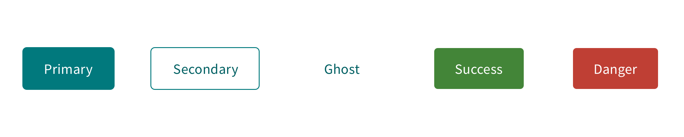
PrimarySecondaryGhostDangerSuccessButton sizes#
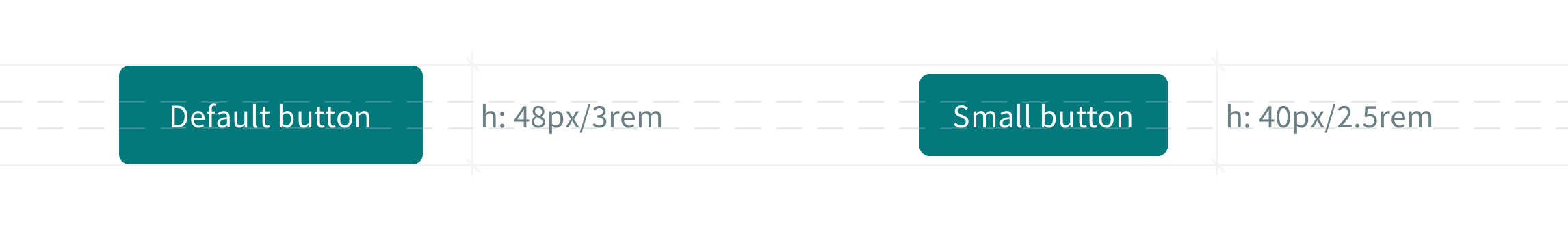
Large 48px/3remMedium 40px/2.5remSmall 28px/1.75remAlignment#
Alignment rules will help you understand how to align your buttons based on the context of the interface.
Left sideRight sideCenterHierarchy#
Visual hierarchy in the UI is crucial. It helps to find the needed elements and information efficiently.
Having a single high-emphasis button clarifies that other buttons are less important in the hierarchy.
At the same time, the layout can also contain more than one button at a time. A high-emphasis button can be followed by medium- and low-emphasis buttons that perform less critical actions.
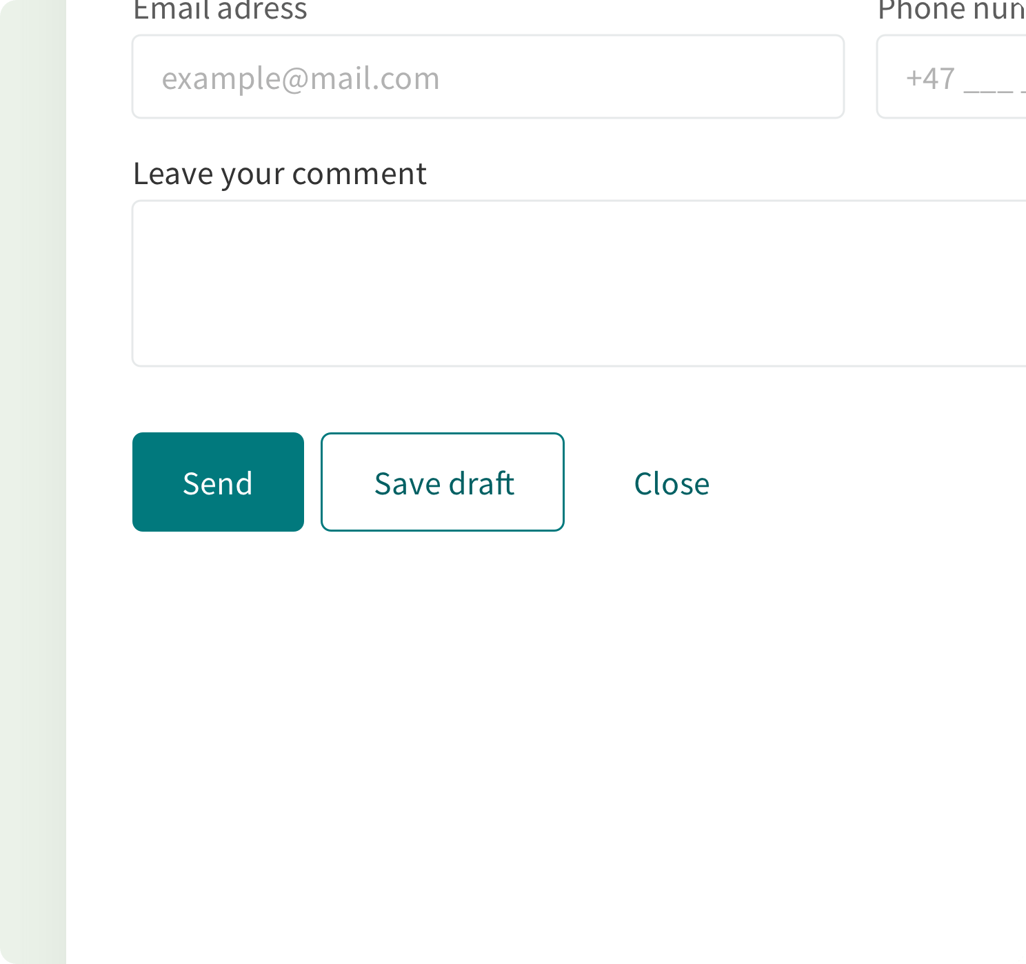
Text labels#
Text labels are communicating the action that will be performed when the user interacts with the button. Text labels in buttons must be clear, not long as poems, and predictable.
Buttons with icons#
A button can include an icon to clarify and call attention to a specific action.
- Icons within the buttons should be
16px/1remby16px/1rem - Use icons that are directly related to the action that the user is taking
The alignment of icons within buttons depends on the layout and the context of where these elements are used.
Icon-only buttons#
In some cases, an icon-only button can be used in the layout. Usually, such practice is used for simple meaning actions.

An example of a correct replacement of the text labels with icons.
Don't replace a complicated text label with a single icon
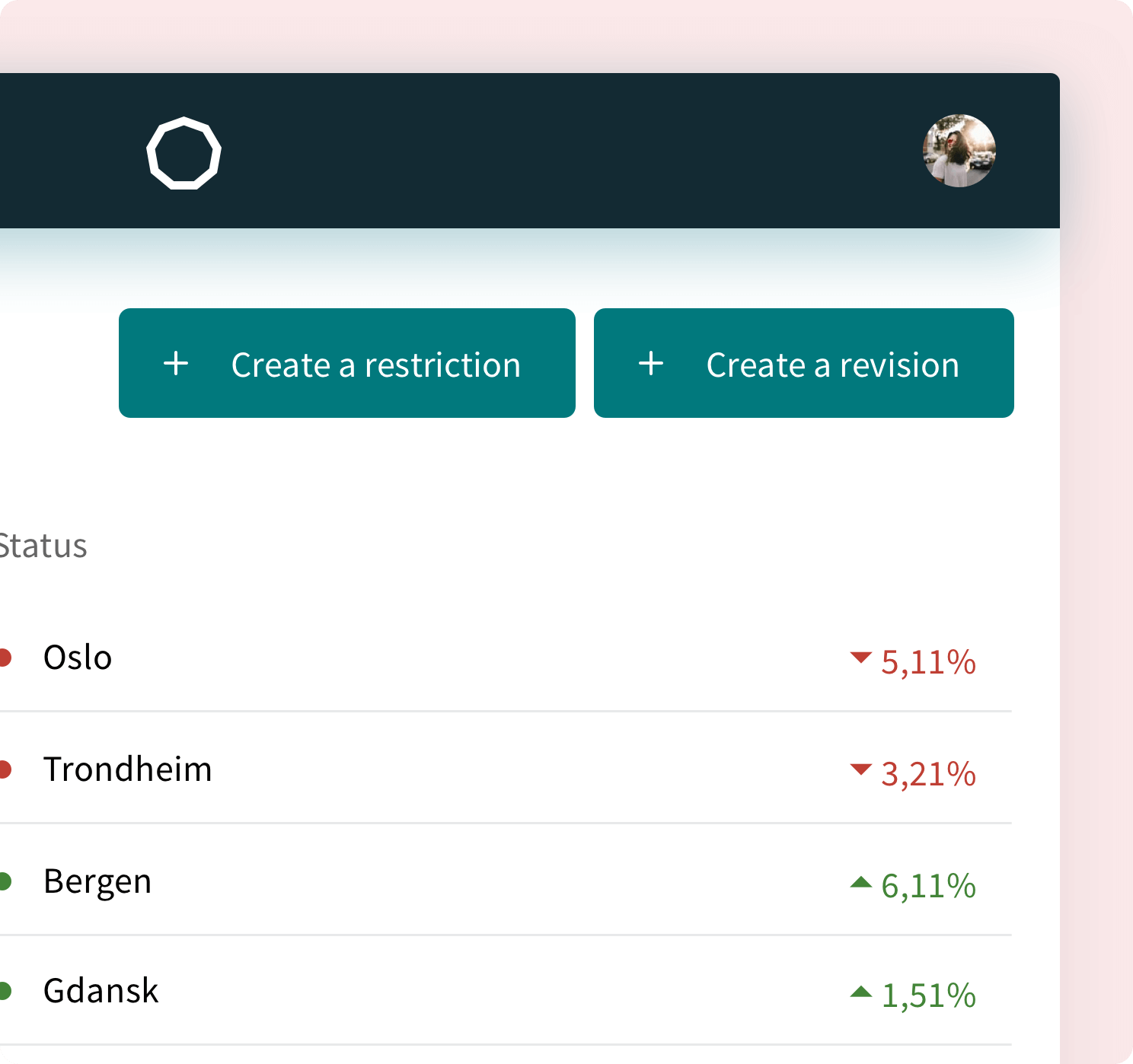
Not all actions can be replaced with an icon.Button groups#
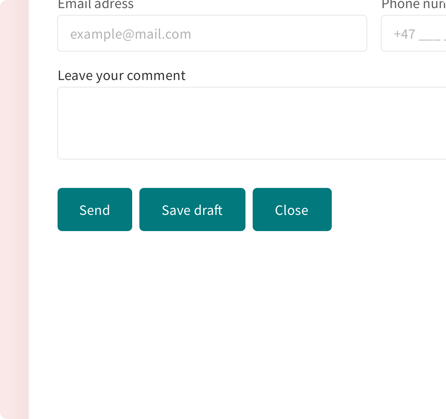
You can group together buttons related by function. A button group is a series of buttons laid out next to each other, joined together to create one continuous UI.
Button groups are useful to create "toggles" that allow to switch between two or more options. This can be used to filter content for example.
Danger and success buttons#
Danger and success buttons are available in three types: primary, success, ghost. The use of each depends on the level of emphasis of the action.
Map controllers#
A lot of Volume products are operating using maps. Follow the guide below to make sure that your map controlling buttons are consistent and convenient.

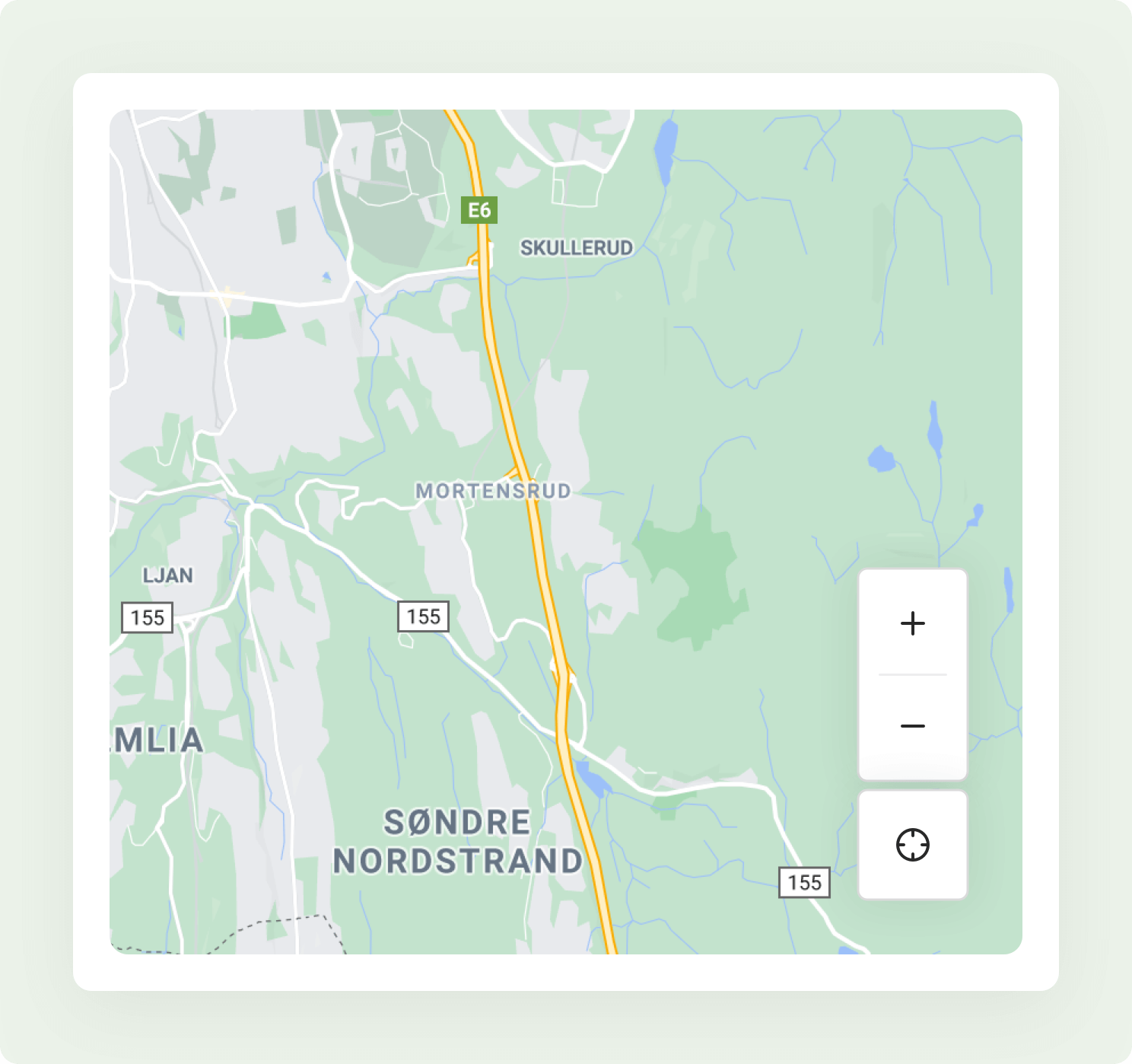
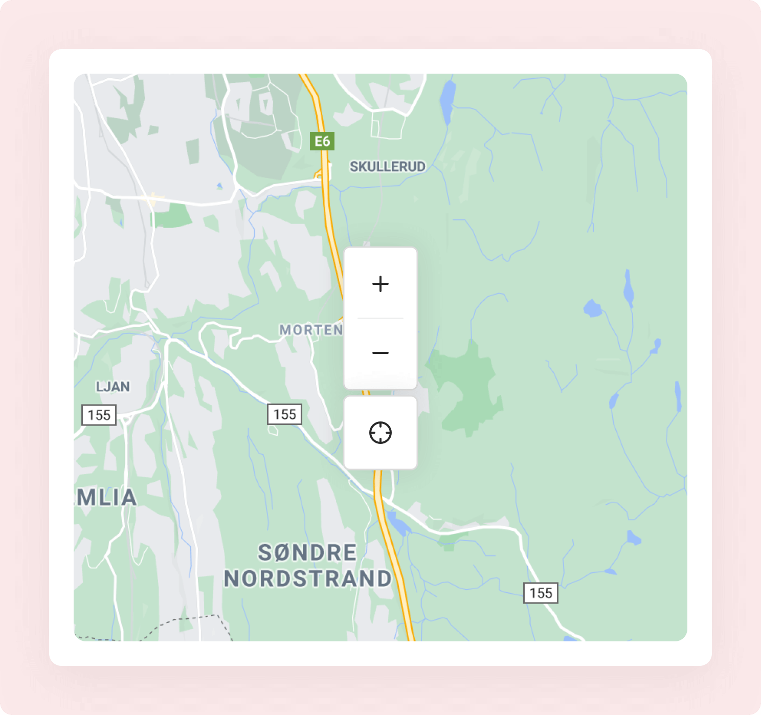
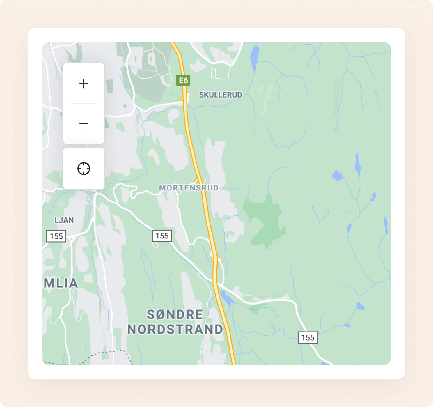
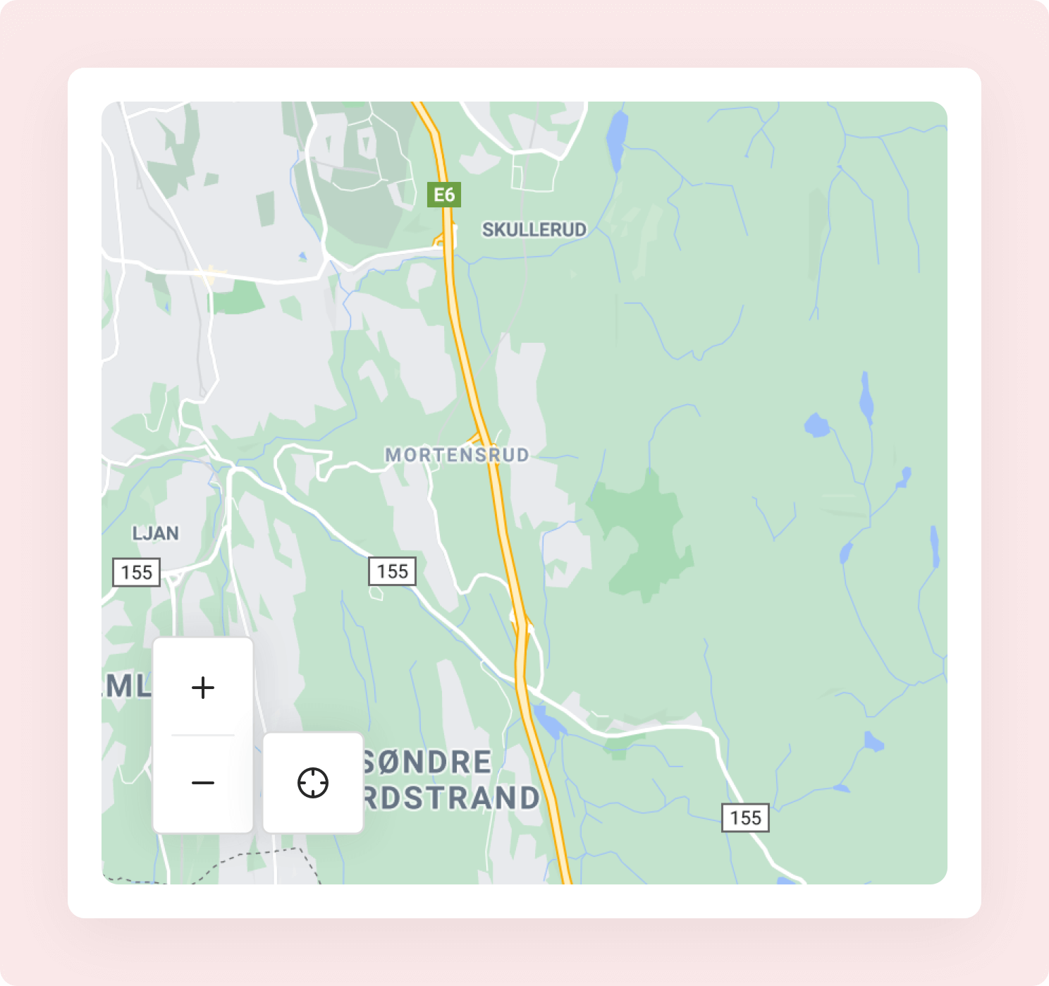
A recommendation for the icon of the My location controller.

Locate icon
Use the `locate` icon for web applications, where the GPS navigation is unavailable.