Empty States
Empty states are moments where there is nothing to display. This often occurs when you set up an app for the first time. Objects that can be empty are pages, cards, widgets, tables, lists, etc.
A useful empty state will let the user know what’s happening, why it’s happening, and what to do about it.
First use#

- Placeholder message
- When to use
- Occurs when setting up an app for the very first time when there is still nothing to show.
- Description
- Show the volue logo + an empathic text to welcome the user to the product.
Additionally give instructions what to do to get started. E.G. importing data or connecting to an API. - Behaviour
- The placeholder message should be positioned in the center of the empty space.
- Components to use
-
User cleared#

- Placeholder message
- When to use
- Occurs when users complete actions such as clearing their inbox or task list, and the result is an empty screen.
- Description
- Show a positive icon + an text to explain the current state.
- Behaviour
- The placeholder message should be positioned in the center of the empty space.
Errors#

- Placeholder message
- When to use
- These occur when something goes wrong, or when there are issues such as a mobile phone going offline due to network problems.
- Description
- Show a warning icon + an text to explain the current state and if possible what to do to resolve the error.
- Behaviour
- The placeholder message should be positioned in the center of the empty space.
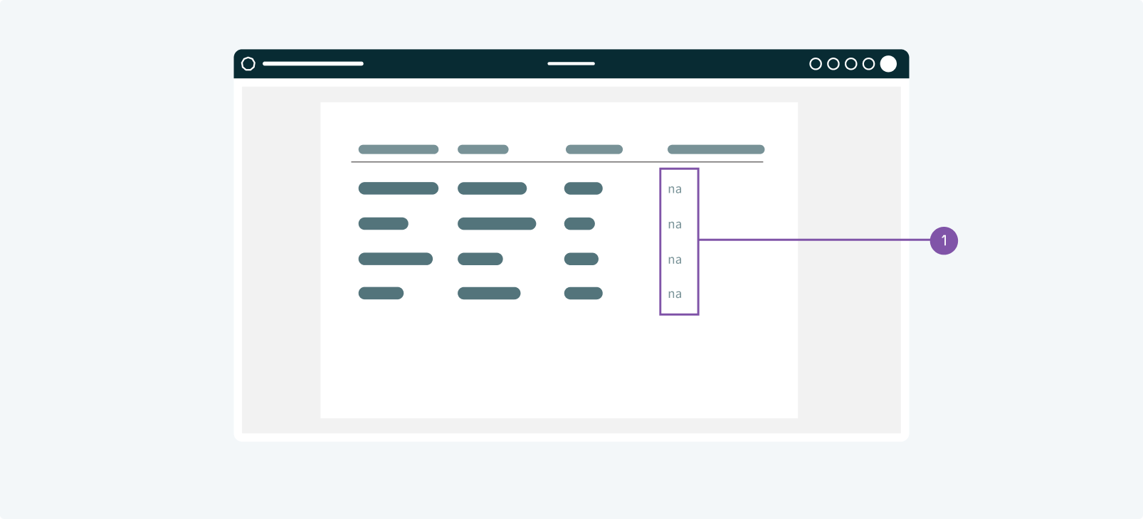
No results/No data#
- Placeholder message
- When to use
- No data found UI design occurs when there is nothing to show. This can happen if someone performs a search and the query is empty or there isn’t data available to show (when filtering for a date-range that has no data for example).
- Description
- Show a subtle text placeholder, such as "na" ("not available") or "no data"
- Behaviour
- The test placeholder should be positioned were the data would be shown.