Dialog
Dialog displays content that requires user interaction, via a layer that sits on top of the page content.
Types of dialogs#
Such dialogs can display more complex data like application forms or description of an entity.
Just want a text notification? Try Toaster component.
Import#
import { Dialog } from '@volue/wave-react';// you may also access Dialog's context via hook:// import { useDialogContext } from '@volue/wave-react';
Dialog is a compound component that consists of multiple parts to help you create all kinds of dialogs:
-
Dialog.Root: The wrapper that contains all the parts of a dialog and provides context for its children. -
Dialog.Trigger: The button that opens the dialog. -
Dialog.Box: The container for the dialog's content. -
Dialog.Header: The header of the dialog. -
Dialog.Title: The title that labels the dialog. -
Dialog.Body: The wrapper that houses the dialog's main content. -
Dialog.Footer: The footer that houses the dialog actions. -
Dialog.Close: The button that closes the dialog.
Examples#
Basic#
Dialog works in an uncontrolled way by default, meaning each Dialog component instance is responsible for managing its own state internally.
The Dialog.Trigger component can be instructed via as prop to render as something else. In our case we want to render it as a <Button> component.
Controlled Dialog#
You can easily make the dialog controlled, by passing your own state to isOpen prop.
onIsOpenChange handler is called when the state of the dialog changes, allowing you to sync state.
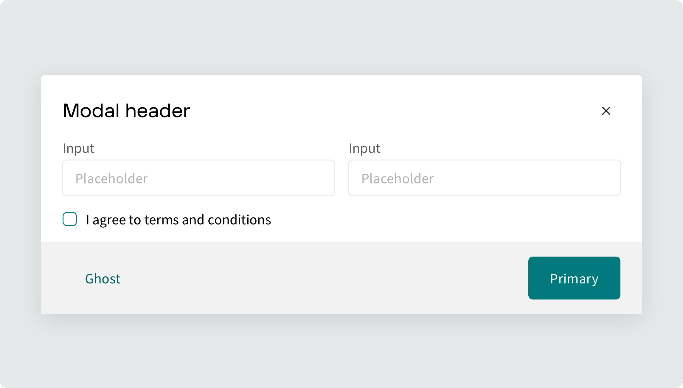
Dialog with header and body#
Use Dialog.Header, Dialog.Title, Dialog.Close and Dialog.Body parts to construct dialog box with a header and scrollable content.
-
Dialog.Titletakes the title you pass in and labels the dialog with it through ARIA attributes to provide accessible experience. -
Dialog.Bodyensures that the body of the dialog becomes scrollable when there is not enough space to fit.
Dialog with footer#
Use Dialog.Footer to add a footer to your dialog and include any action buttons inside.
Stack component can be helpful to layout the buttons.
Dialog with dividers#
Use withDividers prop on Dialog.Body to add subtle dividers between dialog sections.
Use useHasOverflow hook to dynamically apply dividers only when content overflows Dialog.Body area.
import { useHasOverflow } from '@volue/wave-react';
Sizes#
Use size prop to control the size of the Dialog. medium and small sizes are available, with the medium size used by default.
Customizable width#
Use width prop to customize width of the Dialog.Box. It will act as a maximum width of the dialog, but if the viewport width is less than that, the dialog will shrink accordingly.
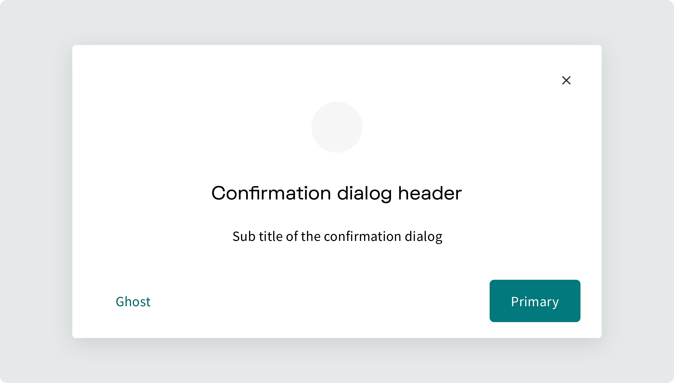
Confirmation dialog example#
Confirmation on dialog hide#
You can prevent users from accidentally closing a dialog with unsaved changes by displaying a nested confirmation dialog. This can be achieved by preventing the default close behavior and programmatically opening a controlled, nested dialog.
Accessibility features#
-
When the dialog opens, focus is sent into the dialog and set to the first tabbable element. Focus stays trapped within the dialog until close is requested. After closing, focus is restored back to the trigger element.
-
Clicking on the overlay closes the dialog.
-
Pressing ESC closes the dialog.
-
Scrolling is blocked on the elements behind the dialog.
-
The dialog is portaled (via Portal utility) to the end of
document.bodyto break it out of the source order. -
Manages screen reader announcements with
Dialog.Title.
API Reference#
Dialog.Root#
Prop | Type | Default |
|---|---|---|
isOpen | boolean | false |
defaultIsOpen | boolean | No default value |
onIsOpenChange | function | No default value |
size | enum | "medium" |
Dialog.Trigger#
Prop | Type | Default |
|---|---|---|
as | enum | button |
css | StitchesCss | No default value |
Dialog.Box#
Prop | Type | Default |
|---|---|---|
css | StitchesCss | No default value |
width | string | number | "38rem" |
padding | SpacingToken | No default value |
zIndex | number | No default value |
onExitComplete | function | () => void |
onPointerDownOutside | function | No default value |
onEscapeKeyDown | function | No default value |
shouldCloseOnOverlayClick | boolean | true |
shouldCloseOnEsc | boolean | true |
Dialog.Header#
In addition to the props below, you can pass Box props to control the spacing.
Prop | Type | Default |
|---|---|---|
css | StitchesCss | No default value |
Dialog.Title#
In addition to the props below, you can pass Heading props.
Prop | Type | Default |
|---|---|---|
as | enum | button |
css | StitchesCss | No default value |
Dialog.Body#
In addition to the props below, you can pass Box props to control the spacing.
Prop | Type | Default |
|---|---|---|
css | StitchesCss | No default value |
withDividers | boolean | false |
Dialog.Footer#
In addition to the props below, you can pass Box props to control the spacing.
Prop | Type | Default |
|---|---|---|
css | StitchesCss | No default value |
Dialog.Close#
Prop | Type | Default |
|---|---|---|
as | enum | button |
css | StitchesCss | No default value |