Settings
The settings let users change the functionality, behaviour and look of an application.
Settings in header#

- Setting icon in header
- When to use
- Whenever there is an application header it should contain a settings icon on its right side second position. Clicking this icon opens the settings.
- Behaviour
- Regular behaviour of a nav button of the header.
- Components
-
-
Settings as drawer#
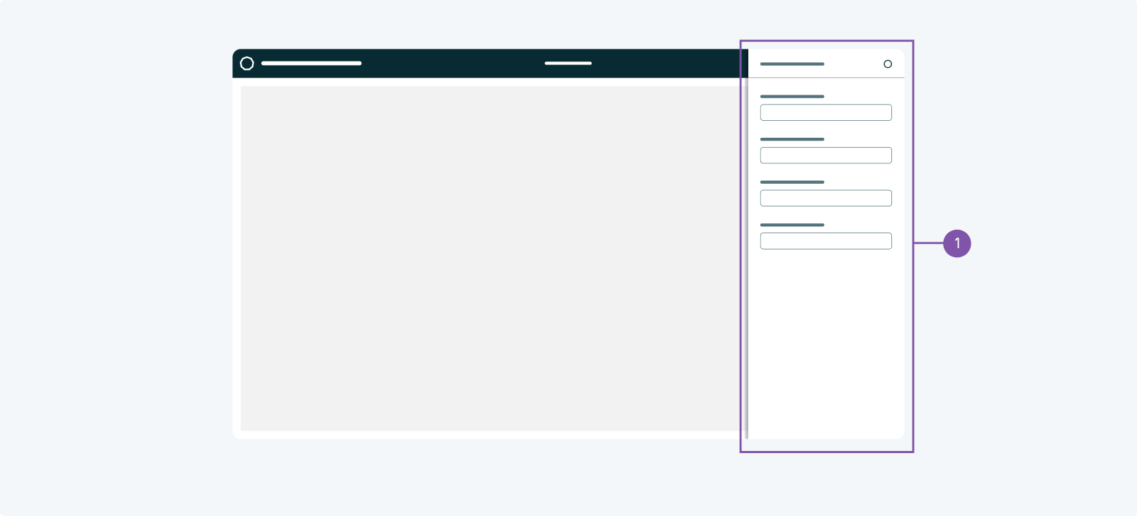
- Settings as drawer
- When to use
- Whenever the settings are opened via an icon in the application header and do not contain a lot of content it is recommended to show them on a drawer. (If they do contain a lot of data you have to use a landing page to display the settings)
- Behaviour
- The drawer opens from the right and overlaps any content. It can be closed by clicking the close x icon.
- Component
- Drawer
Settings in sidebar#
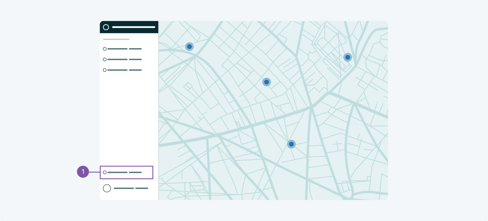
- Setting icon in sidebar
- When to use
- Whenever there is no application header but a sidebar, the sidebar should contain a settings icon on the sidebar footer, above the avatar. Clicking this icon opens the settings.
- Behaviour
- Regular behaviour of a sidebar item.
- Components
-
-
Settings as landing page#
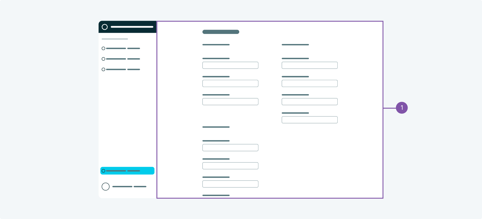
- Settings as landing page
- When to use
- Whenever the settings are opened via an icon in the sidebar or do not contain a lot of content it is recommended to show them on a landing page.
- Behaviour
- The page opens as a regular landing page. Its page layout can be set to centered. The settings sidebar item should be active.
- Component
- Sidebar Navigation