Selection
If the user has to make a selection, which often means to choose one or multiple options and switch settings on or off, you should offer them the right type of selection control.
Wave comes with these types of selection controls:
| Selection control | When to use | Use for how many options to choose from |
|---|---|---|
| Single select menu | Mutually exclusive selection of one choice | many options |
| Multi select menu | Selection of multiple choices | many options |
| Radio list | Mutually exclusive selection of one choice | 2 to 5 options |
| Checkbox list | Selection of multiple choices | 2 to 5 options |
| Single checkbox | Choose the status of one option (on/off) | exactly 2 options |
| Switch | Choose the status of one option (on/off)n | exactly 2 options |
To learn more check out Nielsen Norman Group articles Checkboxes vs. Radio Buttons and Toggle-Switch Guidelines
Single select menu#
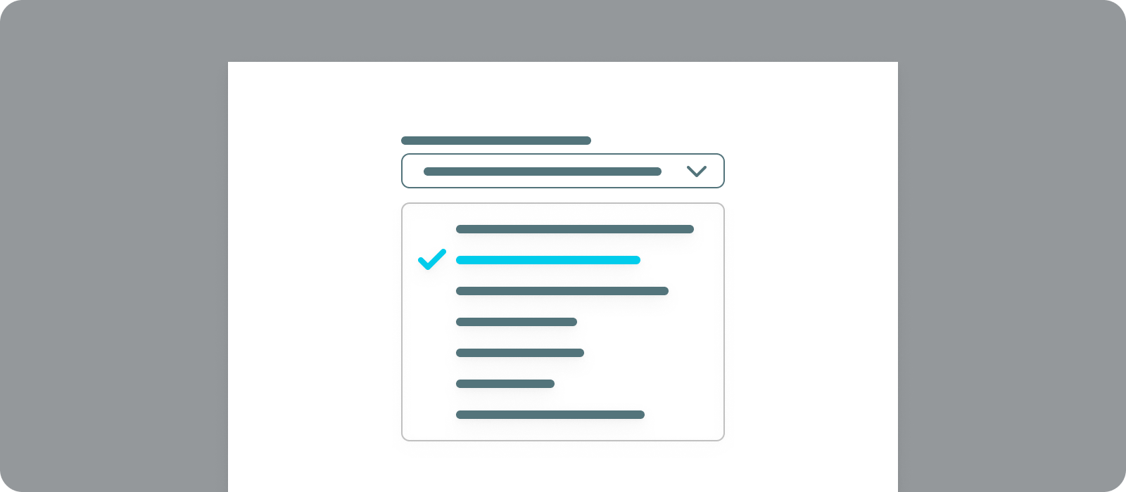
- When to use
- Use a single select menu when the menu options are mutually exclusive and are more than appr. 5 items.
- Description
- Single-select menus allow users to pick one option from a list. Only one option can be chosen at a time.
Single-select menus are great for selection, especially when filtering or setting up values of a parametrization.
Do not use this control to activate anything or trigger any functions. - Components to use
-
Multi select menu#
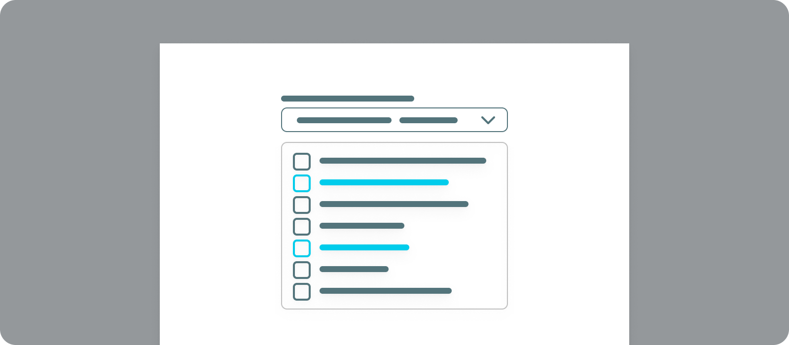
- When to use
- Use a multi select menu when the menu options are **not** mutually exclusive and are more than appr. 5 items.
- Description
- Multi-select menus allow users to pick one or multiple options from a list. Multiple options can be chosen at a time.
Multi-select menus are great for selection, especially when filtering or setting up values of a parametrization.
Do not use this control to activate anything or trigger any functions. - Components to use
-
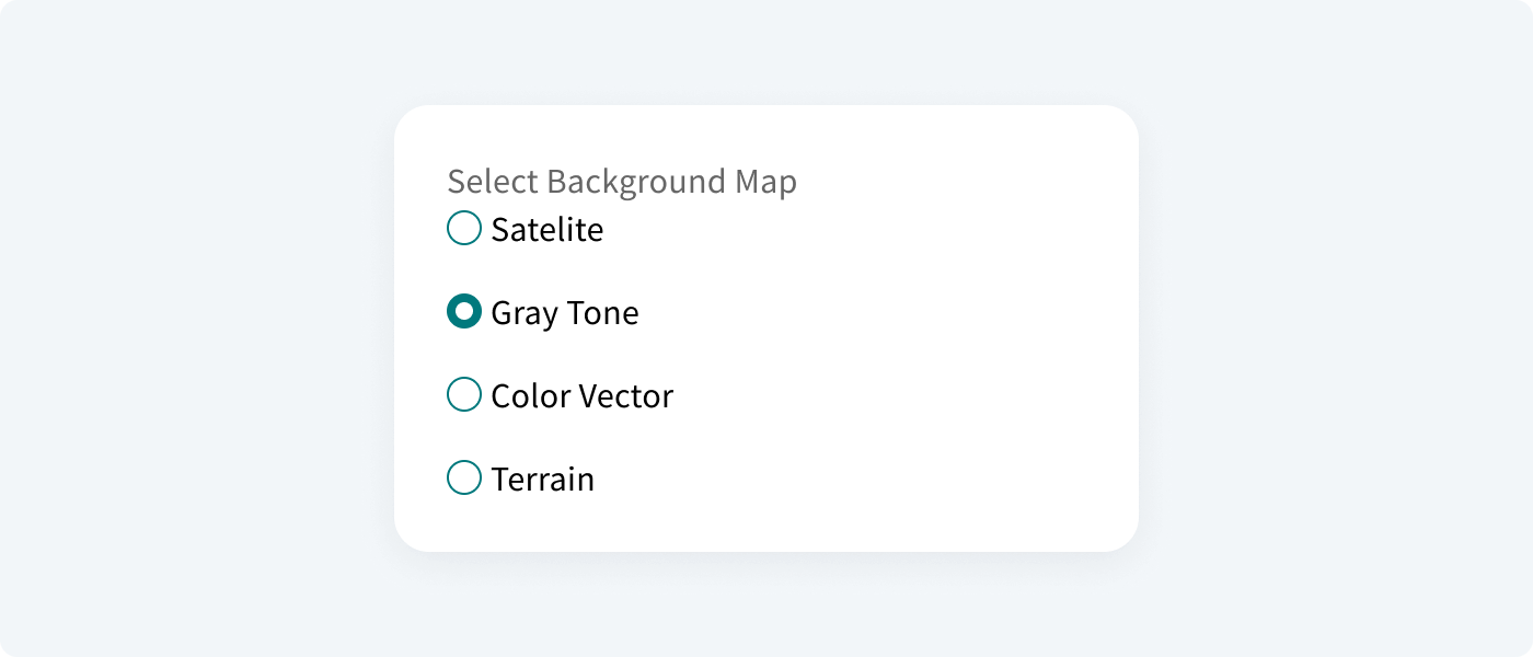
Radio list#
A radio button is a component that lets the user select one option from a group at a time. It is best to use them for 2–4 elements. Remember these things
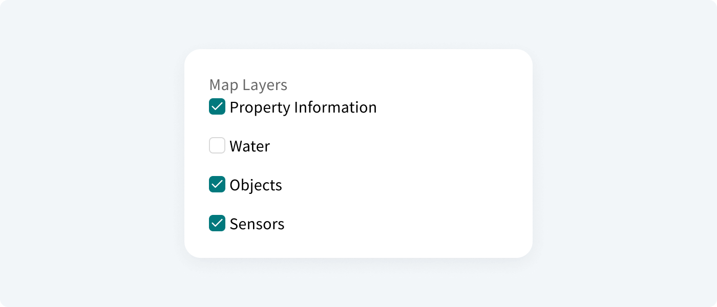
Checkbox list#
A checkbox is a component that lets the user select one or multiple options from a group at a time. A checkbox control has three states: unselected, selected, and indeterminate.
Single checkbox#
A checkbox is a component that lets the user select one or multiple options from a group at a time. A checkbox control has three states: unselected, selected, and indeterminate.
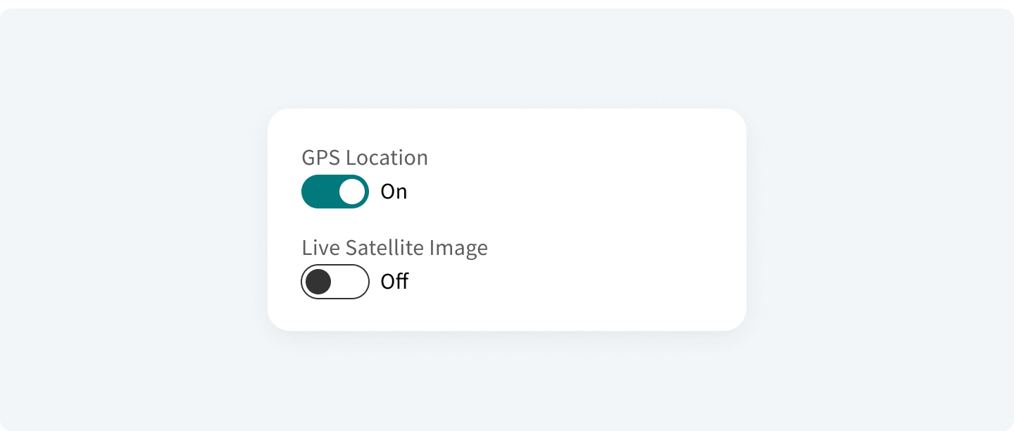
Switch#
A switch is a component that switches between two states and provides an immediate action/response on the screen. A switch button does not need to be confirmed when switching between states.