Navigation
The navigation defines how the user accesses pages of content. So whenever you have an app that contains multiple pages you need to choose a suitable navigation.
Basically there are two types of navigation:
- Tab navigation
- Sidebar
In short the sidebar is recommended for applications with many pages and even subpages. The tab navigation should only be used for a limited number of pages (up to 7 pages). For more complex applications it is possible to combine both patterns.
Tab navigation#

- When to use
- Use for a navigation with upto appr. 7 pages.
- Description
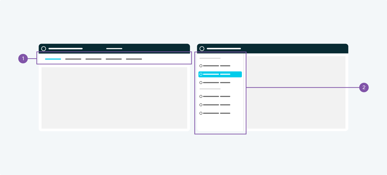
- The tab navigation is a horizontal list of clickable page titles at the top of the main container. It stays visible and fixed, while the content underneath changes due to the selected tab. The active tab is clearly highlighted to give orientation to the user.
- Behaviour
- The tab navigation is at the top of the screen while the content container is below. When scrolling the tab navigation remains fixed and the content container scrolls underneath it.
The first tab should be active by default. - Components to use
-
Sidebar#
- When to use
- Use for a navigation with multiple pages.
- Description
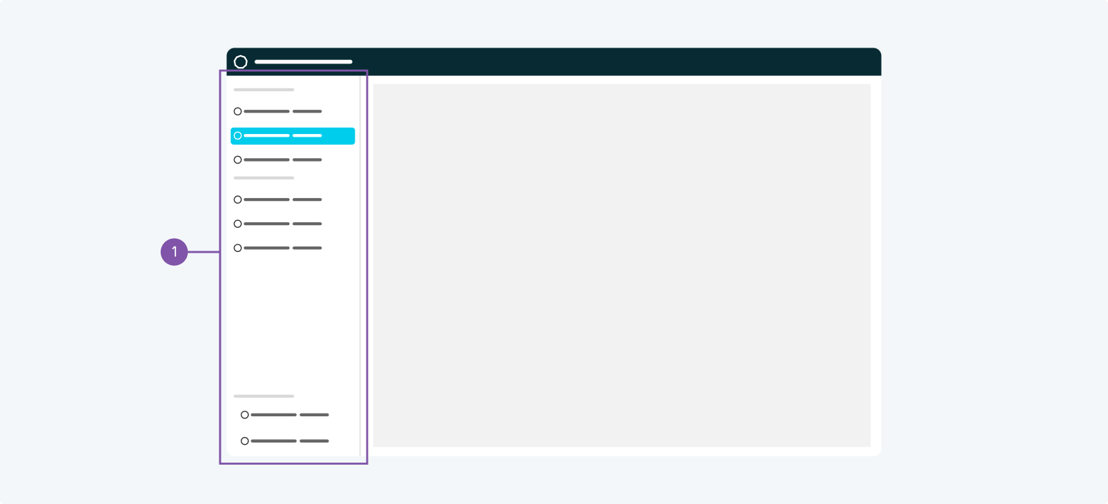
- The sidebar navigation is a vertical list of clickable page titles at the left of the main container. It stays visible and fixed, while the content next to it changes due to the selected item. The active item is clearly highlighted to give orientation to the user.
The sidebar can either be integrated as level 1 component as layout with a sidebar or as subordinated component with a layout with a header. - Behaviour
- The sidebar navigation is at the left of the screen while the content container is next to it. When scrolling the sidebar navigation remains fixed.
The first item should be active by default. - Components to use
-
Tab navigation and sidebar#

- Tab navigation
- Sidebar
- When to use
- You can choose to combine the tab navigation for your primary pages with a sidebar for you subpages.
- Description
- The tab navigation serves as your primary navigation. The sidebar can be used additionally to offer navigation of subpages.
- Behaviour
- The tab navigation is on the top, any content, including the sidebar goes underneath it. The sidebar navigation is at the left of the screen while the content container is next to it. When scrolling the sidebar navigation remains fixed.
The first tab and the first item of the sidebar should be active by default. - Components to use
-
-
- Demos
-