Selection Control
Overview
Selection controls allow users to complete tasks involving choices such as choosing one or multiple options and switching settings on or off.
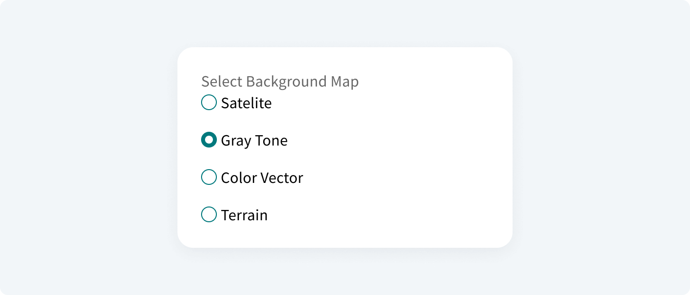
Radio buttons#
A radio button is a component that lets the user select one option from a group at a time. It is best to use them for 2–4 elements. Remember these things

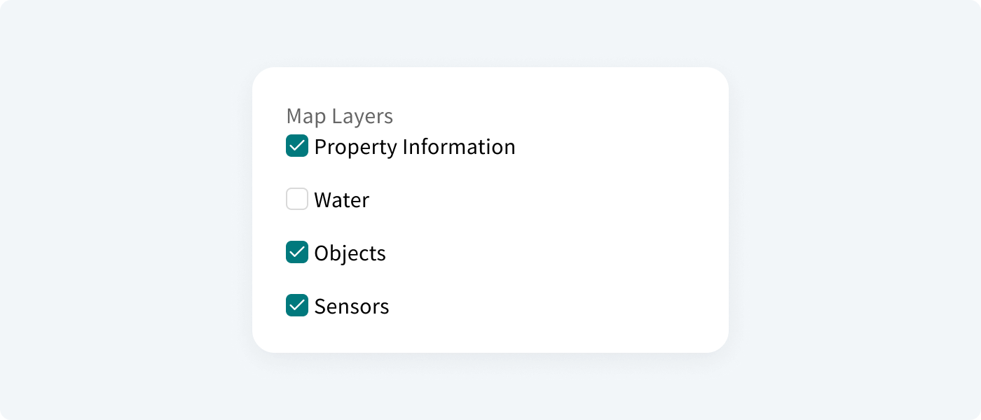
Checkboxes#
A checkbox is a component that lets the user select one or multiple options from a group at a time. A checkbox control has three states: unselected, selected, and indeterminate.

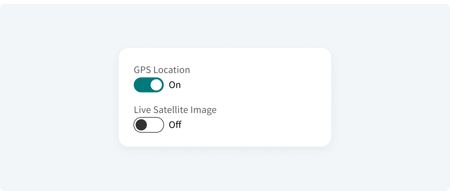
Switch Buttons#
A switch is a component that switches between two states and provides an immediate action/response on the screen. A switch button does not need to be confirmed when switching between states.
